Designing for people with no or limited mobility
People with limited or no mobility use a wide range of assistive technology, alternative input devices, and accessibility settings to interact with digital content. As you design your websites and mobile apps, how can you ensure they work well for them? This post explores important considerations for designing for people with moving disabilities.
People we are designing for
Many permanent, temporary, and situational factors may impact people's ability to move parts of their bodies. For example, permanent moving disabilitiescaused by medical conditions or injuries, temporary injuries such as a broken arm, or the loss of dexterity due to cold hands
When designing digital content, it's important to consider the needs of, and navigation strategies used by, people with different types of moving disabilities:
- People with no upper body mobility: people who don't have, or are unable to move, arms or hands use alternative methods to interact with web content, such as speech recognition and eye tracking software
- People with limited dexterity: people with limited mobility in their arms or hands often use adaptive input devices such as ergonomic mice and keyboards, and accessibility settings like Sticky Keys or Filter Keys
Meet Josh: a sportsman who has spinal muscular atrophy and learn how he navigates the web and what challenges he faces.

Design considerations
Designing your digital to products comply with technical accessibility requirements, such as the Web Content Accessibility Guidelines (WCAG), will ensure they work well with the assistive technology used by people with moving disabilities. However, providing a fully inclusive and enjoyable experience requires additional design considerations.
Design for keyboard access
Many people browse with a keyboard.
For people with limited dexterity, a keyboard is generally easier to use than a mouse. People unable to use either, often rely on assistive technology that emulates keyboard input, such as speech recognition software or Switch Control.
Designing products that can be used with a keyboard is therefore key. While keyboard accessibility is implemented at the development stage, many design choices impact the experience of people navigating with a keyboard or keyboard-emulating assistive technology.
Designing a logical and clear focus order and a clearly visible focus style helps build an enjoyable experience for keyboard users.
Logical focus order
Unlike mouse users, who have greater flexibility in the order in which they access content, people who navigate websites and mobile apps with a keyboard can only follow a linear order.
To make the experience of keyboard users as easy and enjoyable as possible, design a logical and efficient focus order. People should be able to reach all focusable elements on a web page or mobile screen in the expected order and in the most efficient way. This is especially important when interacting with complex components, such as a dialog or a chatbot.
Consider a modal dialog. When it opens, the focus should move to it straight away so people can start interacting with the modal contents. When it closes, people will expect to move back to the button that triggered it. If people are taken anywhere else, for example to the top of the page, they will have to navigate back to the place they triggered the modal from, which is inefficient and can be tiring for some.
Next time you design an interactive component, ask yourself "where would I expect to move to next?" or "where would I expect to end up if I select this item?"
A well-designed focus order enables people to complete tasks with the least effort, without getting lost or having to retrace their steps.
Clearly visible focus style
An equally important aspect of keyboard accessibility is making it easy for people to know where they are on the page. A highly visible focus style does just that.
While all browsers provide their own default focus style, designing your own has many benefits:
- You can ensure it remains visible on all background colours
- It results in a more consistent experience across browsers
- If using brand colours, it can contribute to your products' visual identity
On the TetraLogical website, a clearly visible border in one of TetraLogical's brand colours is displayed around the focused element:
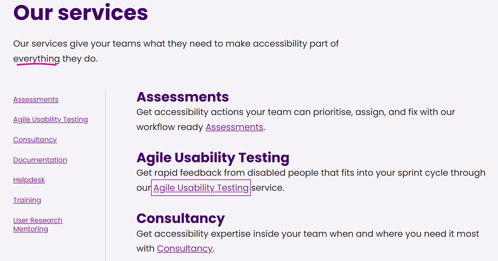
Success Criterion 1.4.11 Non-text Contrast (Level AA) from the WCAG 2.2 requires focus styles to have a minimum contrast ratio of 3:1 with the adjacent colours. However, aiming for a higher contrast ratio helps make the focus style easier to see on small screens and in bright lighting conditions.
Limit focusable items
Even when the focus is clearly visible and follows a logical order, navigating pages that contain a large amount of interactive elements can be time-consuming and tiring for keyboard users.
In addition to providing skip links, as described below, carefully consider the number of interactive elements to include in each web page or app screen. Unless they add value to the content, they may not need to be there.
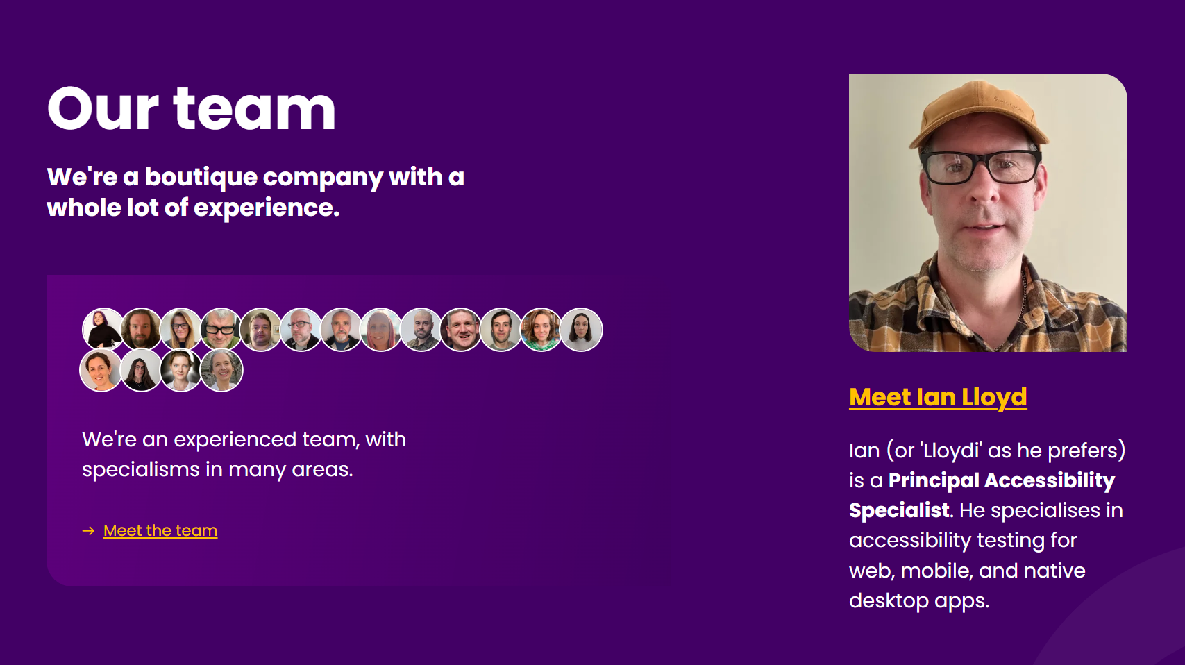
For example, on the homepage of the TetraLogical website, the "Our team" section contains the avatars of all team members. While it may be tempting to make each a link to the person's bio, that would add 16 tab stops to the page. Instead, a single "Meet the team" link is available for people interested in learning more about TetraLogical's members:
Design for voice access
People browsing with speech recognition can navigate to, and interact with, web content using voice commands. For example, they can say "tab" to move to the next focusable element, "scroll down" to move down the page, or "click Register" to select a button with a visible text label of "Register". This is a convenient way to access digital content for people who find using a mouse or keyboard difficult or impossible.
There are a few common design considerations for people navigating using speech recognition.
Unique text labels
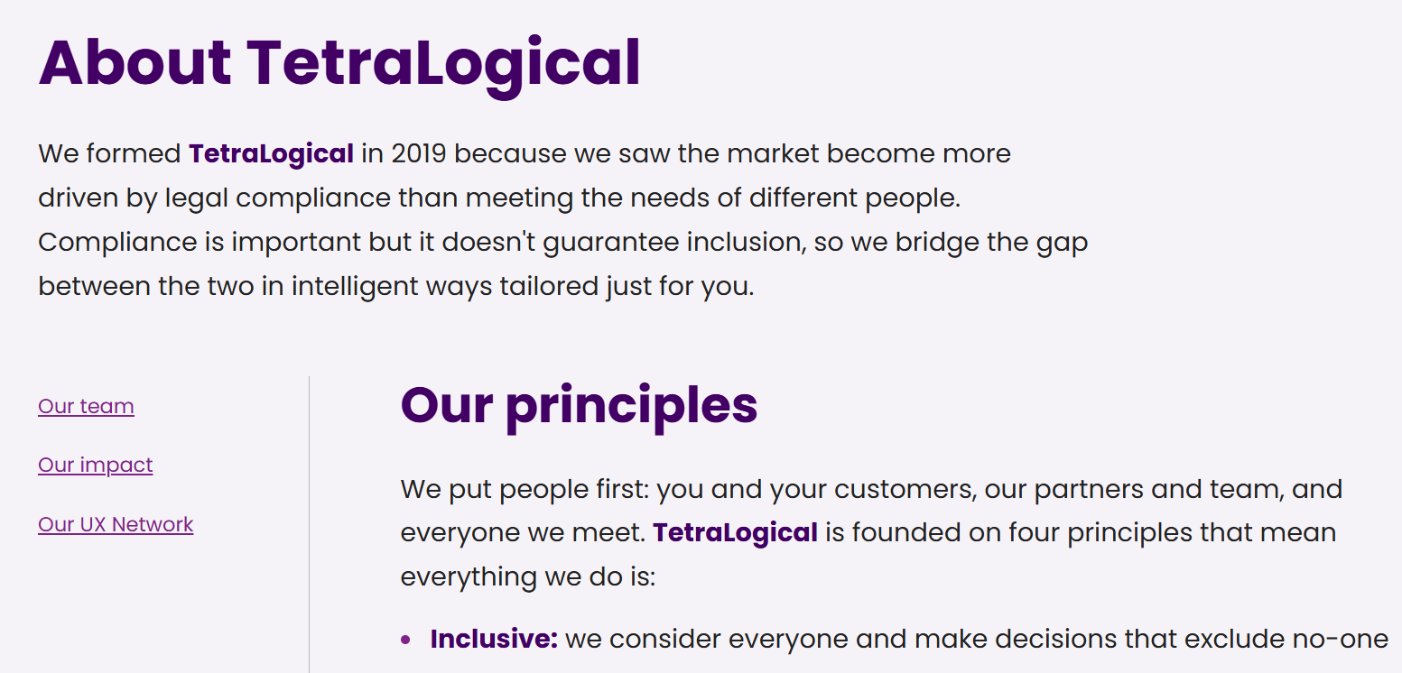
The easiest way for speech recognition users to select an item is to say "click" followed by the item's visible text label. For example, on the About TetraLogical page, they can say "click our team" to select the "Our team" link:
This doesn't work for items that have no visible text label, or that share the same label with other interactive elements. On a page containing several "Read more" links, for example, saying "Click read more" will always activate the first one. People will have to employ more complex strategies to reach and select one of the other "Read more" links.
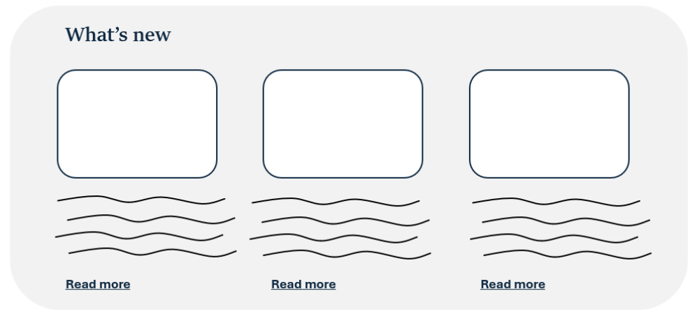
The first Inclusive Design Principle, Provide comparable experience, states:
Ensure your interface provides a comparable experience for all so people can accomplish tasks in a way that suits their needs without undermining the quality of the content.
Providing all actionable items with a visible and unique text label ensures that speech recognition users can reach and select them as easily and efficiently as mouse or keyboard users, thus offering a comparable experience.
Consistent visual presentation
Unless items look interactive, people using speech recognition may not realise they can select them. By default, keyboard users reach all focusable items on a page as they navigate content sequentially; mouse users may accidentally discover that an item is actionable as its appearance changes when the cursor is hovered over it. However, speech recognition users are unlikely to try to activate an element if they don't think it's interactive.
Another Inclusive Design Principle comes into play here - Be consistent:
Use familiar conventions and apply them consistently.
When designing links, buttons, and other interactive components apply well-known conventions so it's easier for people to understand their functionality. Applying a consistent visual treatment to the same component types across the website or mobile app also helps people quickly recognise them.
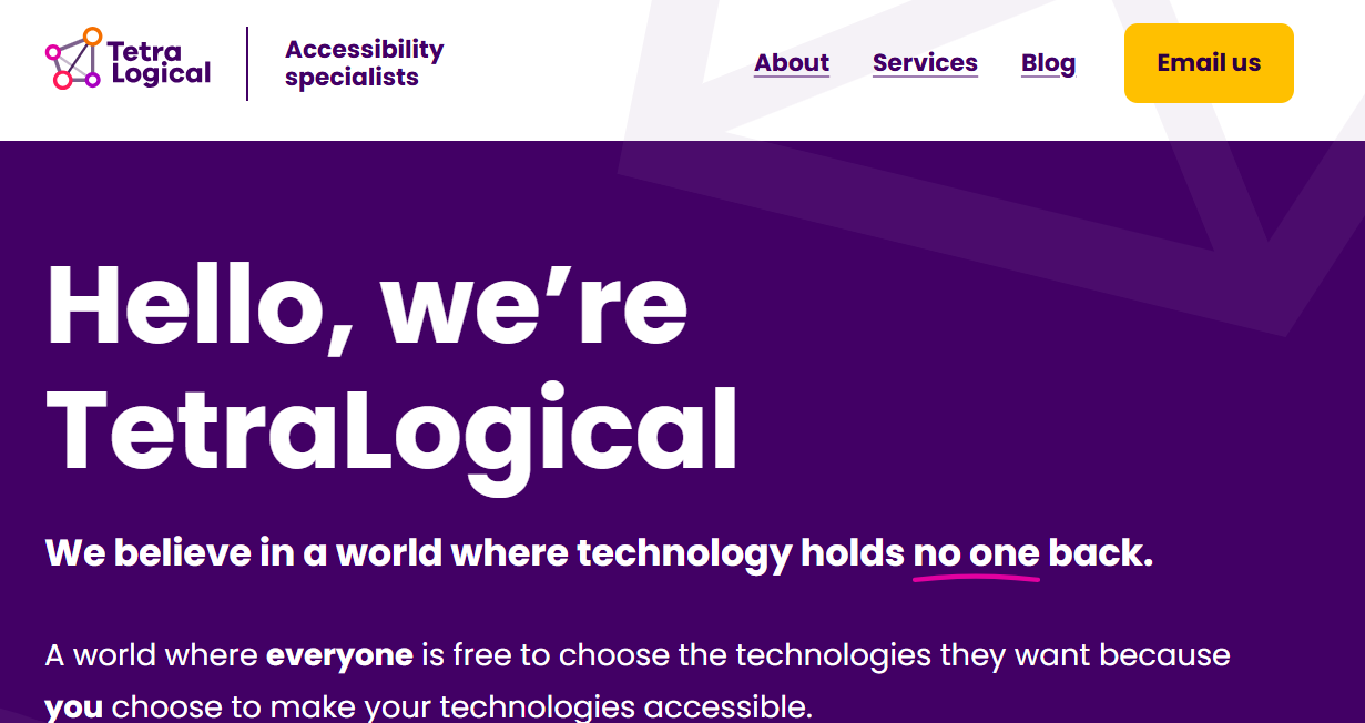
For example, all links on the TetraLogical website are underlined, and all buttons have a bright yellow background:
Building and using an in-house accessible design system can help achieve consistency.
Design for different setups
The Consider situation Inclusive Design Principle invites you to consider the different situations in which people may be using your products:
People use your interface in different situations. Make sure your interface delivers a valuable experience to people regardless of their circumstances.
This is of particular relevance when designing for people with moving disabilities, who often can use digital products in specific setups only.
Think of a person with no mobility in their arms - they may have their mobile device mounted on a workstation or their tablet mounted on a wheelchair. This means they can only use websites and apps in a specific screen orientation. They may also need to use a larger zoom or magnification level, as the device may be quite far from their eyes.

Not only should your products remain accessible in all the setups people may need or prefer to use them, they should also provide an enjoyable experience in all those setups.
Accommodate different orientations
WCAG's Success Criterion 1.3.4 Orientation (Level AA) requires content to be available in both portrait and landscape orientations. It is therefore responsibility of the development team to implement support for both orientation modes.
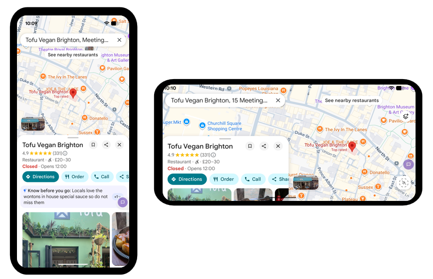
However, it is up to designers to create an enjoyable experience in both orientations. For each orientation, consider how best to present the content so it has a logical and meaningful flow and is easy to operate.
For example, when switching between portrait and landscape orientations, the search field and information panel in Google Maps reposition so that a large portion of the map remains visible.
Account for different zoom levels
Similarly, consider how you can ensure that content remains available and easy to read, understand, and operate at all zoom levels.
You may need to design alternative page layouts for different zoom levels, or adjust the visual presentation of components so they fit nicely when content reflows.
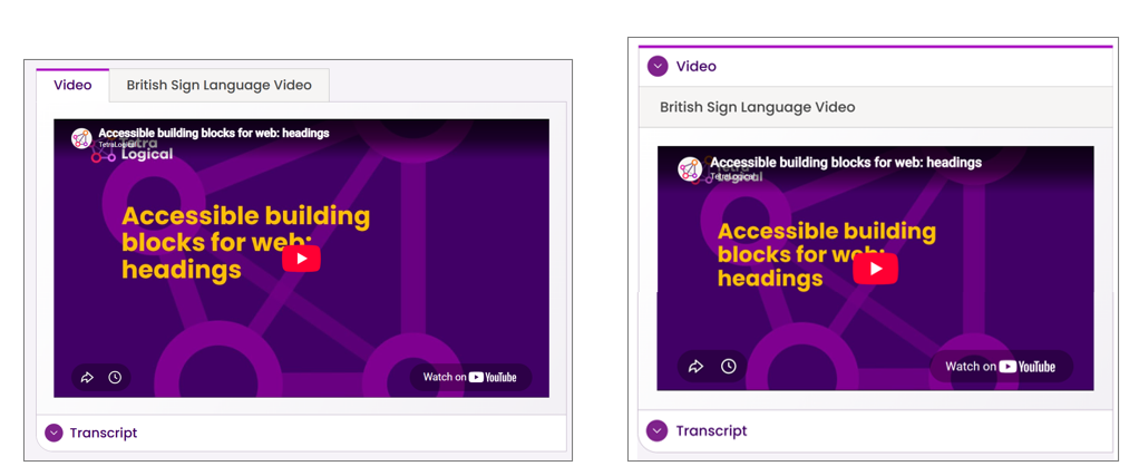
On the TetraLogical website, the visual presentation of the tab panel component used to display two versions of the same video - with and without British Sign Language interpreter - changes when the pages are viewed at a high zoom level. The tabs are displayed next to each other at the standard zoom level, and one below the other at a large zoom level.
Design for efficient navigation
Navigating content using a keyboard, alternative input methods such as Switch Control, or assistive technology like speech recognition software or eye tracking can be time consuming. For some people with disabilities, it can also be physically demanding and tiring.
Any design decision that contributes to making information on your website or mobile app as easy and quick to find as possible is therefore highly valuable. From prioritising content, to offering a way to quickly reach the main content area, to providing a search functionality, these are all ways to build a more efficient and inclusive navigation system.
Prioritise important content
The Prioritise content Inclusive Design Principle states:
Help users focus on core tasks, features, and information by prioritising them within the content and layout
By limiting the amount of content on each page or screen and placing the most important information or commonly used items at the start, you can help people find and reach the content of interest quickly.
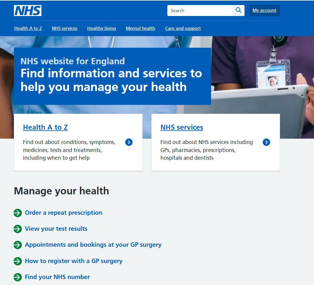
When landing on the homepage of the NHS website, for example, people are presented with two prominent tiles that take them straight to the "Health A to Z" and "NHS services" pages. Following these tiles, is a list of five links that allow people to quickly start common tasks, such as ordering a prescription, viewing test results, and so on. Any additional information or services are displayed towards the end of the page. This is a great way to prioritise important information and commonly used functionality.
Include skip links
Providing skip links is another way to help people quickly reach the content they are after.
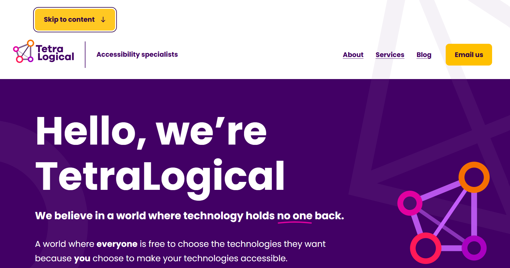
Skip links allow people to move directly to a section of content they are interested in, skipping all preceding content. A common use of skip links is to let people bypass navigation menus and immediately reach the main content area of a page.
Here is the Skip to content link on the TetraLogical homepage.
On pages with a lot of content, it may be useful to offer multiple skip links so people can easily reach specific sections or functionality. However, avoid adding too many, or they will end up increasing the number of navigation steps on the page, rather than reducing them.
Skip links are of particular value to people who can only access web content sequentially, such as keyboard or Switch Control users. Without skip links, they'd have to tab through many focusable items every time a new page loads, which can be tiring for some people.
Offer a search functionality
The Add value Inclusive Design Principle invites you to consider what features you can add to your products to deliver a better user experience:
Consider the value of features and how they improve the experience for different users.
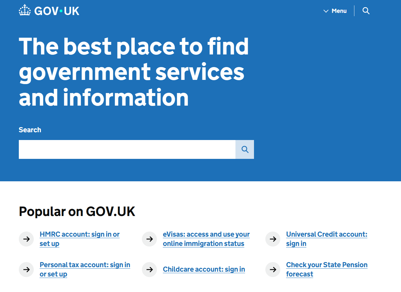
When it comes to making it easier for people to find content of interest, offering a search functionality is a simple and effective way to do so. It removes the need to navigate through pages, navigation menus, and large sections of content to look for a specific piece of information.
A prominent search field is displayed at the top of the GOV.UK homepage, to allow people to search for the content they are after.
Design for limited dexterity
Many people may struggle to perform precise movements on websites or mobile apps, for many different reasons - they may have a permanent or age-related medical condition that causes tremors or reduced motor control, or may be in a cold environment and have stiff fingers.
Here are a few considerations when designing for people with limited dexterity.
Large target areas
Giving interactive elements a large target area is key. It helps all mouse users, and people with limited dexterity in particular, select the desired element with ease. It is also valuable to people operating web content using eye gaze, as it makes it easier to focus on and activate the intended control.
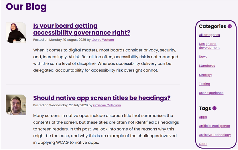
For example, on the TetraLogical website, large spacing is used in lists of links to make it easy for everyone to select the desired link:
When links, buttons, and other interactive items have a small target area, people may not be able to select or operate them. And if the interactive items are close to each other, there is a good chance that people will end up selecting the wrong item by mistake.
To comply with WCAG's Success Criterion 2.5.8 Target Size (Minimum) (Level AA), the interactive items in your products must have a minimum target size of 24 by 24 CSS pixels. However, when possible, design target areas that go beyond the minimum required size, and leave some spacing in between interactive items. This will greatly improve the experience of the people using your products.
Alternatives for complex pointer gestures
For people with limited dexterity, performing complex gestures, either with a mouse or with their fingers, can be challenging. Think of having to drag an item from a location on screen to another, or having to perform a two-finger pinch gesture to zoom in some content on mobile. Not all people can do such movements with ease.
Another Inclusive Design Principle, Offer choice, applies here:
Consider providing different ways for people to complete tasks, especially those that are complex or non standard.
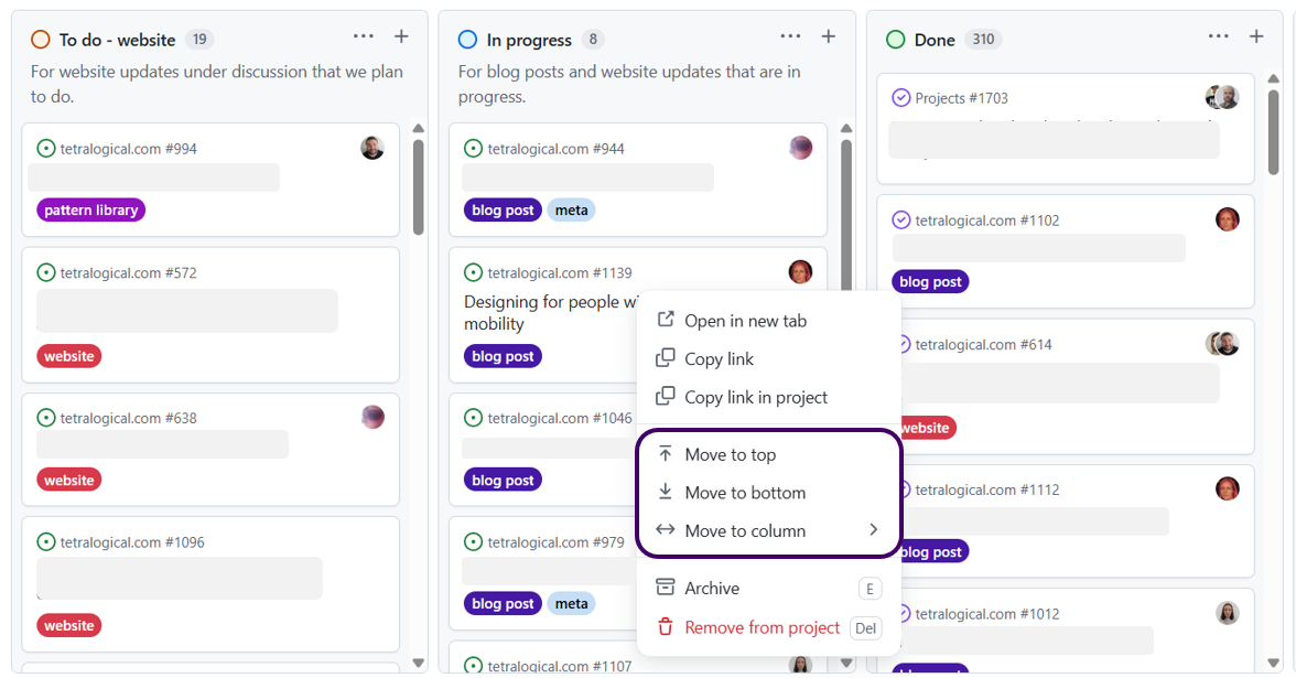
If your products contain functionality that requires complex or multipoint gestures, design alternative ways to complete those same actions. This could be providing increase and decrease buttons to change the value of a slider so people are not forced to drag the slider handle, or allowing people to zoom content in and out by repeatedly tapping a finger on a mobile screen instead of performing a pinch gesture.
In GitHub, it's possible to move an issue ticket by either dragging it to a new location, or using the Move to top, Move to bottom, and Move to column options in the ticket's context menu.
In the Sonos mobile app, when the volume slider is tapped, minus and plus buttons appear to its sides. People can then choose to change the volume by dragging a finger across the slider or tapping once on the minus or plus buttons.

Prevent irreversible actions
People with reduced motor control are more likely to activate items by mistake. For example, on a form, they may accidentally activate the submit button while trying to select a Terms and conditions link next to it.
This can lead to unintended results which, in some cases, can have critical consequences. People may end up submitting incorrect information or deleting an important account, for example.
Designing large target areas, as discussed previously, will reduce the chances of this happening. However, consider what other design choices you can make to ensure that no critical actions with potentially unwanted and harmful consequences occur in your products.
For example, when an item that initiates a critical action is selected, you could:
- Remind people of the consequences of that action
- Ask people to confirm they want to proceed
- Once the action is completed, give people an option to undo it (if possible)
Not only will these design choices be helpful to people with limited dexterity, they will also be of great value to people with thinking and other types of disabilities.
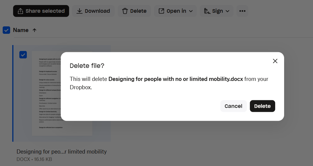
In Dropbox, a "Delete file?" dialog appears when people try to delete a file. The file is removed only after people have confirmed their intention to proceed:
And, after the file is deleted, a confirmation message with an option to Undo the action is displayed:

Design for efficient form completion
For people with limited dexterity and those using assistive technology, filling in forms can prove challenging and tiring. Especially when forms are long and require lots of typing.
Here are some considerations to help you design forms that work well for people with no or limited mobility.
Reduce the need for typing
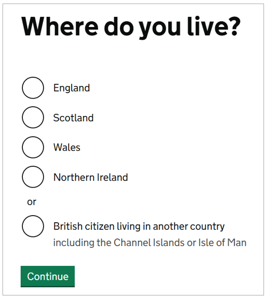
When possible, allow people to select a value from a predefined list of options rather than asking them to type it in. Radio buttons, checkboxes, and dropdowns can all be used to provide people with a range of possible answers.
In this example, radio buttons are used so people don't have to type in the name of the country where they live:
Other design choices that can reduce the need for typing include:
- Pre-populating fields with information that you already hold about your users
- Automatically retrieving and filling in data when possible; for example, once a postcode is provided, the full address can be automatically entered
- As soon as people start typing into fields, using word prediction to generate selectable suggestions
Allow for multiple sessions
People using alternative input devices or assistive technology often take longer to fill in forms. This can become a problem when they are presented with long, multi-step processes; completing such forms can take a long time and be physically and mentally demanding.
When designing multi-step forms, consider providing people with an option to fill them in over several sessions, retaining the information they enter in each session. This allows those who need to take breaks to do so before becoming too tired, which also reduces the chances of making mistakes.
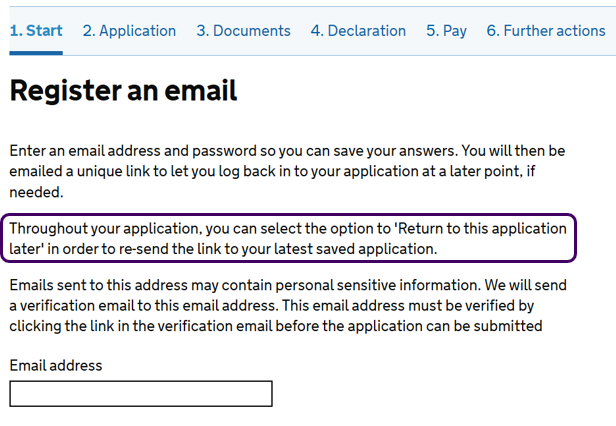
The online application to become a UK citizen consists of six steps, each requiring people to enter information and upload evidence. Not everyone is able to complete such a long process in a single session. At the beginning of the multi-step process, people are asked to register their email address, which then allows them to leave the form and return to it when ready to continue. As the instructions on the website state, "Throughout your application, you can select the option to 'Return to this application later' in order to re-send the link to your latest saved application".
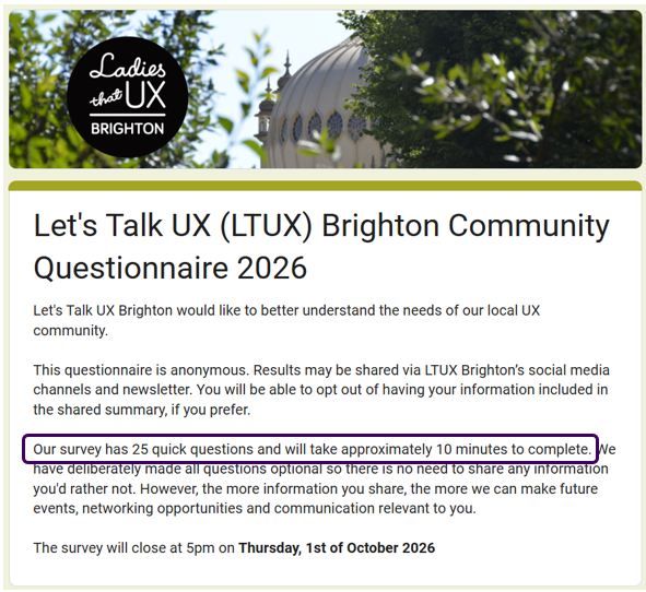
Also, provide clear information about the number of steps involved, and the average time required to complete the form. This can help people decide whether to start filling it in, depending on the time and energy level available.
Sometimes, just a sentence with the number of steps or questions included, and the average completion time, can be useful. The following example contains the instruction "Our survey has 25 quick questions and will take approximately 10 minutes to complete":
Avoid session timeouts
Finally, unless necessary for security reasons, avoid session timeouts.
Session timeouts can make it impossible or very difficult for many people to complete forms. For some people, the allocated time is simply not enough. For others, the additional pressure placed by the timeout makes it more likely to make mistakes.
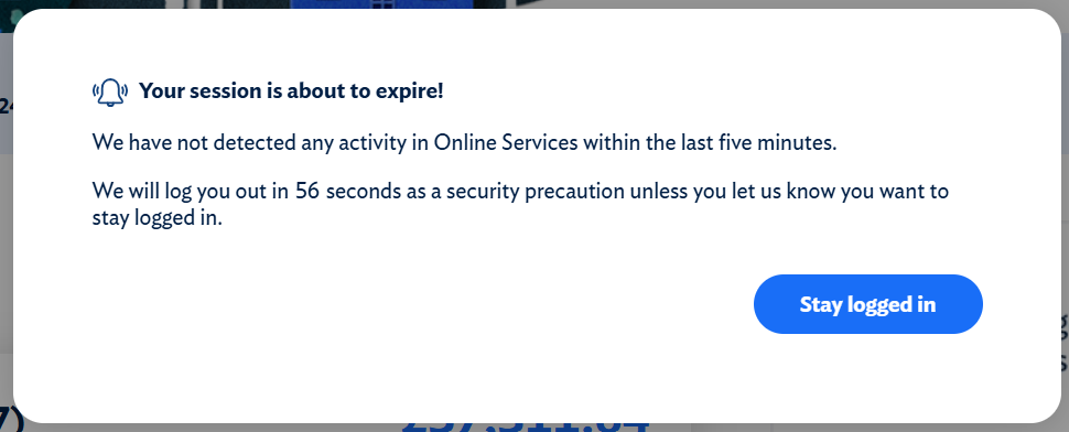
If a session timeout is necessary, design a clear warning message that informs people when the session is about to end, and a simple and accessible way to extend it.
An accessible dialog containing a "Stay logged in", or similar, button is a good solution:
Resources
- TetraLogical: Guide to the Inclusive Design Principles
- W3C Web Accessibility Initiative (WAI): Ade, reporter with limited use of his arms
- W3C WAI: Keyboard Compatibility
- W3C WAI: Large Links, Buttons, and Controls
- W3C WAI: Speech Recognition
Next steps
For more information about the Web Content Accessibility Guidelines, read our WCAG primer or find out more about how our assessments can help you identify issues in your websites, mobile applications, design systems, and other products and services.