Designing for people who are D/deaf
We don't often think about design in relation to the needs and expectations of D/deaf people. However, many of the choices we make when designing products and services - from the positioning and labelling of items to the selection of form elements and the use of plain language - can have a significant impact on the experience of D/deaf people.
People we are designing for
Deafness is a hearing disability and refers to profound hearing loss. Unlike people with milder hearing loss who still have some hearing capability, D/deaf people have very little hearing or none at all.
An important distinction when talking about people with deafness is between Deaf (upper case D) and deaf (lower case d) people:
- Deaf people (upper case D) identify as part of a cultural and linguistic community and typically use sign language to communicate
- deaf people (lower case d) have profound hearing loss but don't necessarily identify with the Deaf community; often they are people who have lost their hearing later in life
Some D/deaf people use assistive devices such as hearing aids, and all rely on captions and text transcripts to access audio content on the web and in mobile apps.
Meet Steve: a photographer who is deaf and low vision and learn about some of the strategies he uses to navigate the web.

Design considerations
Designing digital experiences that work well for people who are D/deaf goes beyond providing captions and a sign language interpretation, as required by the Web Content Accessibility Guidelines (WCAG). As discussed in Designing for people with disabilities, accessible design should be about considering and addressing the needs and expectations of people, not meeting standards.
Make audio content accessible
To many, accessibility for D/deaf people means providing alternatives to audio content, such as transcripts for podcasts and captions or a sign language interpretation for videos. This requirement is also covered by two WCAG Guidelines:
Applying the Inclusive Design Principles, and other inclusive best practices, when producing these alternatives will ensure they are as useful as possible to D/deaf people.
Provide equivalent alternatives for audio content in media
The first Inclusive Design Principle, Provide comparable experience, states:
Ensure your interface provides a comparable experience for all so people can accomplish tasks in a way that suits their needs without undermining the quality of the content.
Applying the above principle to media alternatives means ensuring they communicate the same information and emotions conveyed by the audio content, and are easy to find and consume. Below are some techniques you can use to achieve this.
Ensure the alternative is accurate
Any media alternative, whether a text transcript, captions, or a sign language interpretation, should be as close as possible to the original content. For example:
- Don't remove filler words such as "uh", "er", "you know" or repetitions
- Don't replace swear words
- Mirror people's accent, for example use "mom" instead of "mum" for an American speaker
Accurate alternatives help create a comparable experience for D/deaf people.
Include all meaningful information
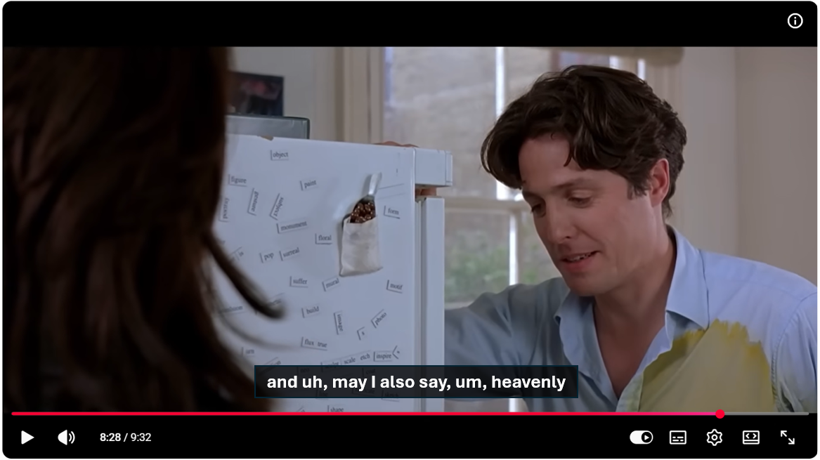
In addition to dialogue, does any other content in the audio track convey information? If so, include it in the alternatives. It could be the sound of a door closing, some lyrics playing in the background, eerie music suggesting that something dangerous is about to happen.
Including meaningful sounds and music in your alternatives is key to conveying emotions and full context.
![A scene from The Shining with captions visible. Captions read "[eerie music]"](images/captions-music.png)
Synchronise alternatives with the media content
A key aspect of captions and sign language interpretations is their synchronisation with the visual content.
When consuming multimedia content, hearing people rely on both audio and visual information to understand what's happening. For example, they may listen to the dialogue while watching people's body language and facial expressions. This is why synchronisation between the audio and visual content is important.
Similarly, captions need to be synchronised with the visuals, matching the pace and timing of the audio track. This allows D/deaf people to follow the visual content as they read the captions. It is particularly helpful to people who can lip read.
Allow people to adjust the presentation of captions
Another Inclusive Design Principle is Give control:
Ensure people are in control. People should be able to access and interact with content in their preferred way.
Many people with hearing disabilities also have seeing disabilities, especially older people. It is important to ensure that all D/deaf people can read captions with ease.
When choosing or designing a video player, ensure that people can customise the visual presentation of captions, such as their font, size, and colour.
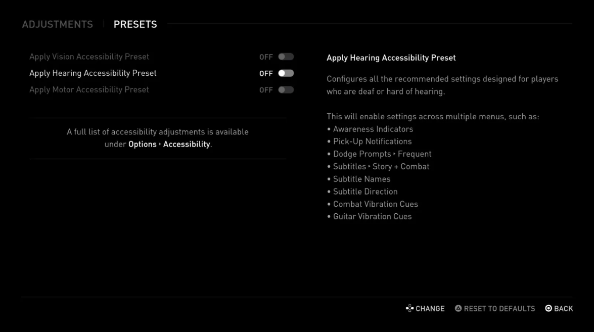
Offer alternatives to audio notifications
In addition to the audio track in media and multimedia, your digital products may include other audio content that conveys information. For example, sound effects are commonly used in games and Extended Reality (XR) experiences to convey important information about actions, events, and the surrounding environment. Sound may also be used as part of notification messages in web and mobile apps; you may be familiar with the sound played by Slack when a new message is received.
This is where the Add value Inclusive Design Principle becomes useful. Instead of focusing solely on how information is conveyed, it encourages us to consider how D/deaf people experience the content and what would create an equivalent experience.
Consider the value of features and how they improve the experience for different users.
When designing alternatives for audio information, consider how you can make the best use of available functionality and technology. In some cases, a simple solution such as displaying the same information in text may work well. In other cases, you may want to implement a more advanced solution, such as haptic feedback for mobile apps.
Make alternatives easy to discover
Once you have created equivalent alternatives for the audio content in your digital products, consider how you can make them as easy as possible for people to discover. Positioning, labelling, and consistency are key here.
Positioning
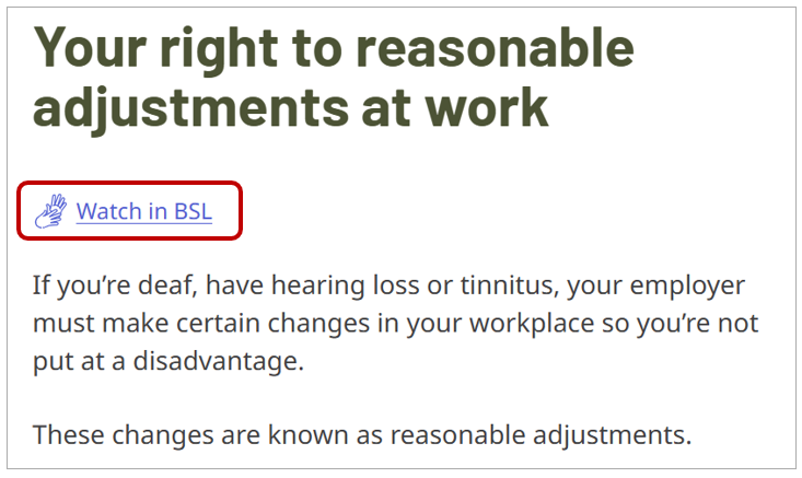
Text transcripts and sign language interpretations should be as close as possible to the multimedia content they relate to. Depending on the layout of your pages, you can place them to the side or just below the audio or video player.
If placing the alternatives on the same page as the multimedia content is not feasible, a link to them should be available and highly noticeable.
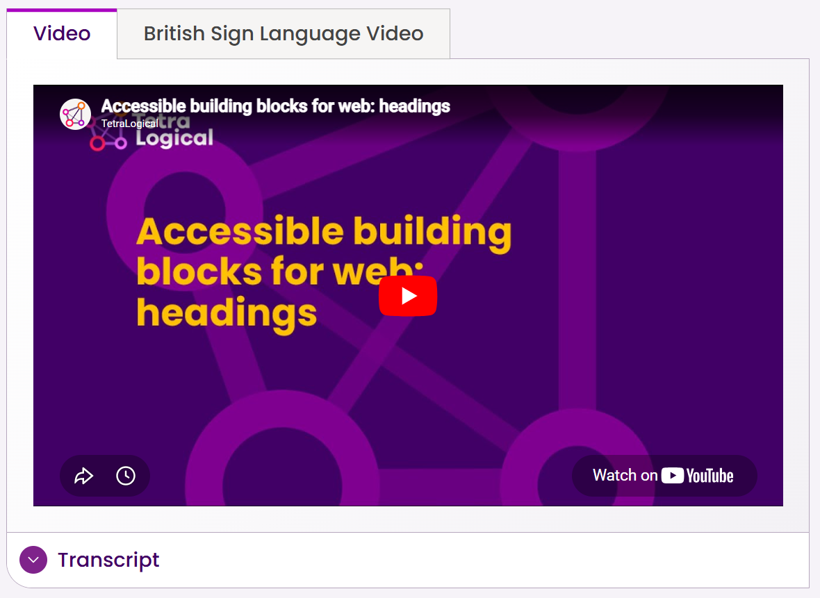
The below screenshot, from Accessible building blocks for the web videos, shows how we, at TetraLogical, display text transcripts and sign language interpretations next to video content.
When it comes to visual or haptic alternatives to audio notifications in games, XR experiences, or other applications, you may decide to offer them by default, so they are available to everyone. For example, in 2024 Fortnite enabled Visualize Sound Effects by default. After offering this feature as an accessibility option for people with hearing disabilities, Epic Games (the video games company) realised it had proved useful to many other players and made it a core feature of the game.
If you decide against enabling them by default, ensure it is as easy as possible for people to discover and activate them in the app settings. Don't hide them within nested settings menus.
Labelling
Using clear and descriptive labels is another way to make alternatives easy to discover.
On the TetraLogical website, we use "British Sign Language Video" and "Transcript" to refer to the sign language version and text transcript of our videos. These are more accurate labels than "BSL video" or "Accessible alternative", for example. Similarly, settings to enable accessibility features should have clear labels.
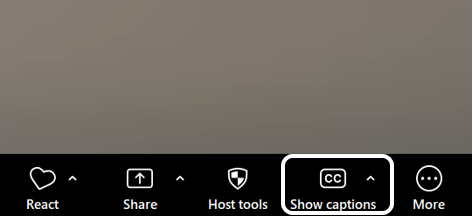
Using icons in your labels, together with text, may also help D/deaf people with comprehension (more on this later). For example, the image of two upper case 'CC' is often used on the button that triggers Closed Captions in video players. When using icons, choose common ones and test them with a wide range of people to make sure their functionality is clear to everyone.
Consistency
Finally, consistency is core to discoverability.
As the third Inclusive Design Principle, Be consistent, states:
Use familiar conventions and apply them consistently.
Using consistent labels and positioning across your digital product will help people find the alternatives and accessibility settings they need as they move around it. This includes visible labels and textual descriptions for images. For example, if using an icon for your Settings menu, give it the same text description on all screens where it appears. This will be especially beneficial for people who are Deafblind and use a screen reader.
Make written content easy to understand
For many people who are born D/deaf, sign language is tehir first language. Reading and understanding written content in English, or a different language, can therefore prove challenging, especially when the language is complex.
When writing content for your digital products, consider how you can make it as easy as possible for everyone to understand.
Use plain language
Using plain language makes any topic easier to understand for everybody. Some of the key principles of plain language include:
- Avoid technical or complex terms, slang, and idioms
- Prefer shorter words to longer ones
- Keep your sentences and paragraphs brief
- Expand acronyms and abbreviations the first time you use them
Design a clear structure
Using a logical structure will also make your content easier to read and understand. Think about separating out content into logical sections and giving each section a clear and descriptive heading.
Using lists when appropriate also improves readability.
Use visuals to reinforce meaning
For people who struggle with written content, visuals may help understand information.
As mentioned under Labelling, icons can be used as part of labels for components. For example, in the TetraLogical Learning Management System (LMS), the button that expands the Table of Contents for each course consists of the visible text "Explore Course" and an hamburger icon. Many people will recognise the purpose of the button from the icon.
Avoid replacing text labels with icons alone. Using icons and text labels together is the most accessible solution as it makes content easy to understand for everyone.
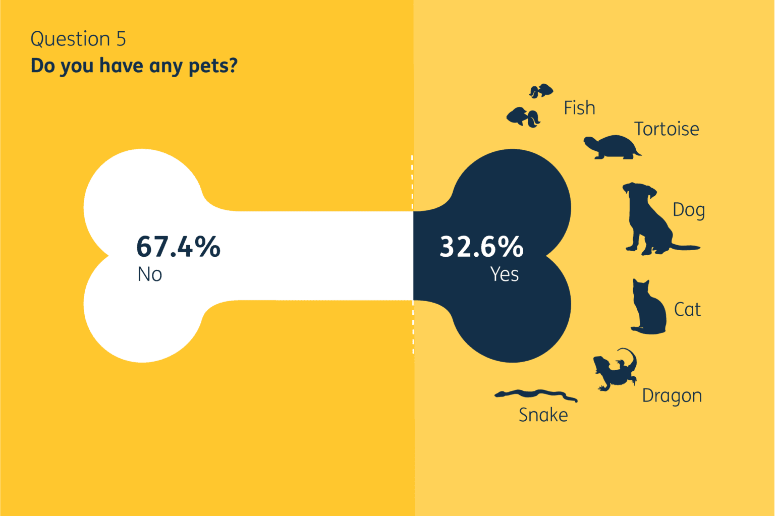
If you have lots of complex information or data to present, consider using infographics. Your infographics should follow good accessibility practices, such as using colour combinations with a strong contrast and high-quality images. This makes the visuals easy to see for everyone, and especially people with low vision.
The following example is from GOV.UK: Data visualisation: how can good design transform your data?
Provide a sign language interpretation for core content
Consider offering a sign language interpretation for key content, such as:
- Important information that impact many people, such as key information on a government website
- Content targetted to D/deaf people specifically
- Legal information, such as the Terms and Conditions of a financial product
Much of the content on the Royal National Institute for Deaf People (RNID) website is available in British Sign Language (BSL):
This is another way to Add value to your products.
Several solutions nowadays use Artificial Intelligence (AI) to instantly translate written content into sign language. This helps organisations make this functionality available for larger volumes of content. However, make sure to verify the accuracy and reliability of these services before using one. For key information, pre-recorded interpretation may still be the best solution.
Make forms easy to fill in
As well as understanding written content, spelling words and using correct grammar can be challenging for people whose first language is sign language. This can have an impact when filling in forms or performing searches.
Here are a few approaches you can take when designing forms, to reduce the chances of people entering incorrect information.
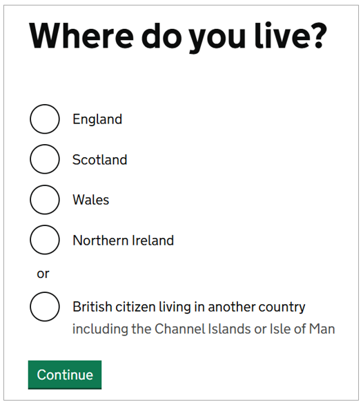
Use predefined options when possible
In some cases, you may be able to predict the possible answers to a question; for example, if asking for a date, you'll know the month will be one of 12 predefined values. You can therefore provide a list of predefined options rather than asking people to manually enter a value. This will reduce the chances of people making mistakes.
Depending on the amount of available options, you can use radio buttons, checkboxes, or a select component.
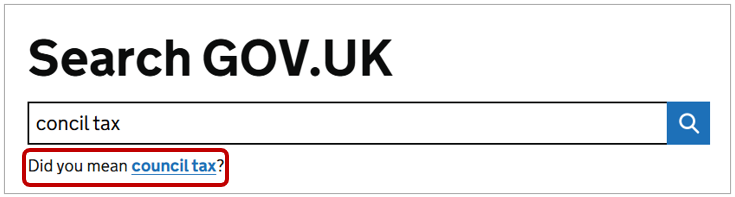
Check and correct spelling
You can also implement a spelling functionality that checks the text entered by people and suggests corrections when needed. This is often done with Search fields and is a great way to Add value to the user experience.
Make the entire journey inclusive
Websites and apps are often just a step in a wider journey. Unless every step in the journey is accessible to D/deaf people, you risk to exclude them. Designing inclusive user journeys means considering the entire experience, not just individual interactions.
Provide options
A key principle of inclusive design is to Offer choice:
Consider providing different ways for people to complete tasks, especially those that are complex or non standard.
When designing user journeys, consider any aspect that may pose barriers to D/deaf people and investigate inclusive alternatives. For example, if people are required to contact a support team as part of an onboarding journey, make sure that making a phone call is not the only way to do so. Similarly, in a Know Your Customer (KYC) journey, offer alternatives ways to verify one's identity as not everyone can record a video of oneself while reading out a script, for example.
Using inclusive personas and involving D/deaf people in the design process are great ways to ensure their needs and preferences are considered.
Resources
- Guide to the Inclusive Design Principles
- Dhruv, older adult student who is deaf
- Subtitle Guidelines
- PLain English Campaign: Free guides and articles
Next steps
For more information about the Web Content Accessibility Guidelines, read our WCAG primer or find out more about how our assessments can help you identify issues in your websites, mobile applications, design systems, and other products and services.