Designing for people with reading disabilities
Design can overlook reading disabilities, but many people struggle to process written text. This post explains how to design digital content that's easier for everyone to read.
People we are designing for
Reading is often treated as a binary skill — you can read or you can't. But reading exists on a broad spectrum of fluency. For many, "decoding" text —turning symbols into meaning — requires a lot of mental effort.
This can affect many people, but especially those with reading disabilities such as:
- Dyslexia: difficulty connecting the visual shapes of letters to their sounds
- Hyperlexia: advanced reading ability without understanding the meaning or context
- Alexia: when a person loses their previous ability to read, usually due to a stroke or injury
Reading disabilities have nothing to do with intelligence. They are a difference in how the brain processes written information. When reading is exhausting, people have less energy for understanding and decision-making.
By designing for these needs, we make life easier for everyone. This includes people in a hurry or those reading in a second language.
Design considerations
Inclusive design goes beyond the Web Content Accessibility Guidelines (WCAG). Designing for reading disabilities is a shared responsibility between editors, copywriters, and designers. The goal is to remove the friction that makes reading feel like hard work.
Use plain language
“If you make your content easy to read, you aren’t ‘dumbing down’, you are opening up your information to anyone who wants to read it. You are making it accessible. You are trying not to exclude people based on their education, cognitive function or reading ability.”
Sarah Winters, Content Design London
We need to unlearn the academic writing style taught at school. Complex sentences create a barrier for people with reading disabilities.
Be direct. Use simple, everyday words and keep sentences short. Instead of "The implementation of the policy will commence", say "The policy starts." This makes your content open to more people.
What about technical writing?
In specialised fields like medicine or law, technical terms are often necessary. In these cases, use short paragraphs and good heading structure. If you must use a complex word, explain it simply the first time it appears. You can also provide a clear link to a glossary.
Format for flow and focus
The way text sits on a screen can affect how easily a person can find and read the next line. To help with this:
- Align text to the left: avoid "justified" blocks of text. These create uneven gaps between words, which can be distracting
- Keep lines short: aim for 70 to 80 characters per line at most. If a line is too long, the eye travels too far to find the start of the next line
- Use clear headings: break your page into small sections with descriptive headings. Use sentence case for headings, for example "Design considerations", not "Design Considerations"
- Size headings by level: text sizes should reflect the heading order. People should be able to see which sections "belong" to each other at a glance
Prioritise font features
Research shows that letter features matter more than using a specific "accessible" font. Follow these typography guidelines when you can:
- Distinct shapes: try to choose fonts where its easy to tell letters and numbers apart, like 'l' and '1', or 'O' and 0, and where similar letters aren't exact mirrors of each other.
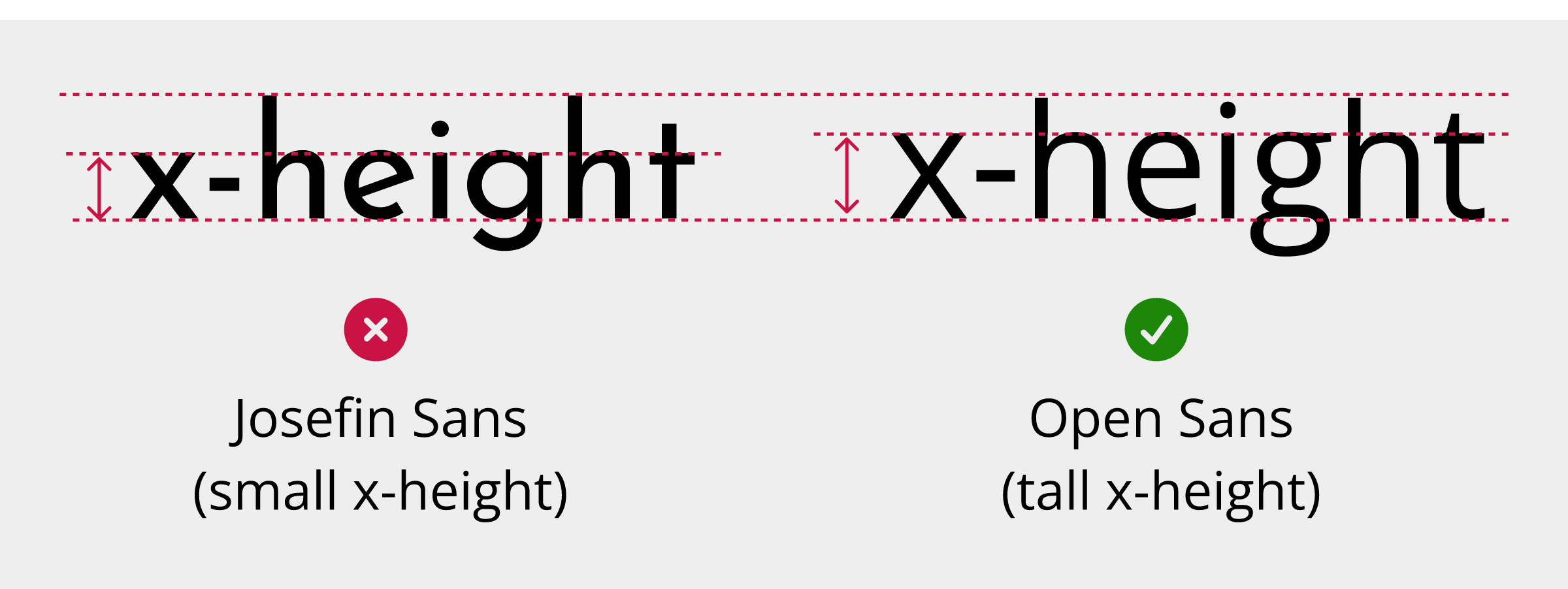
- Taller x-height: look for a font where lowercase letters like 'x', 'a', and 'e' are relatively tall. This can make text easier to read at smaller sizes
- Choose an 'open' font: look for fonts with large gaps inside letters like 'e' or 'p' and between the edges of letters like 'c' and 's'
- Style with care: avoid large chunks of bold or italic text and don't use all-capitalised text
- Line and letter spacing: check that lines and letters are not too close together. Use a “squint test” to see if the text is readable when blurred
Aim for a younger reading level
As mentioned in designing for people with anxiety, the average reading age for adults is often around nine to 11 years old. If your content is written at a university level, you could exclude a lot of people.
Use tools like Hemingway to test your content. If the grade level is too high, break down long sentences.
Explain acronyms and abbreviations
Acronyms and abbreviations can slow people down when reading. To minimise their impact:
- Expand on first use: with acronyms, write the full term followed by the acronym in parentheses. For example, "Web Content Accessibility Guidelines (WCAG)"
- Limit their use: if an acronym only appears once, you may not need it at all
- Avoid too many acronyms together: don't crowd several acronyms into a single paragraph
- Common abbreviations: you may not need to explain very common terms, for example, "USA"
Use images and alternative formats
Text isn't always the best way to share information.
Sometimes a well-placed diagram can explain a complex process faster than text:
Just ensure visuals have text descriptions for the benefit of people who can't see or understand images. The quality and effectiveness of a text description also affects accessibility of images, so make them clear and meaningful.
Sometimes, a video or audio-only alternative can help people with reading or other disabilities to access the information. Our post on an inclusive approach to video production can help you do this in an accessible way.
Design for low digital literacy
Reading disabilities can impact how people navigate the web in general. To support people with low digital literacy:
- Pair text with icons: use recognisable icons to provide an extra visual cue for text labels. For example, use a magnifying glass next to a search field
- Consistent placement: keep navigation and help links in the same place on every page
- Descriptive link text: avoid "click here" or "read more". Use descriptive labels, for example, "download the 2024 report"
Designing for reading disabilities moves us away from assuming how people consume information. We can all help people by focusing on clear words, good structure, and better fonts. These small changes reduce reading effort and create a better experience for everyone.
Resources
- Dyslexia Scotland: Guide to dyslexia-friendly typed content (PDF)
- Content Design London: Readability Guidelines
- GOV.UK Blog: Dos and don'ts on designing for accessibility
- Understanding WCAG 2.2 Success Criterion 3.1.5 Reading Level
Next steps
For more information about the Web Content Accessibility Guidelines, read our WCAG primer or find out more about how our assessments can help you identify issues in your websites, mobile applications, design systems, and other products and services.