Designing for people who are colour blind
Colour blindness can get overlooked in accessible design, but it can have a significant impact on how people access the web, making it harder to notice important information, distinguish interactive elements, or understand data that relies on colour alone.
People we're designing for
Colour blindness, also called colour vision deficiency (CVD), is a condition where a person cannot see the full spectrum of colours. This results in people having trouble telling specific colours apart, especially when those colours are placed next to each other or viewed in low light.
Most people who are colour blind are born with it, although ageing, some medications, and conditions like diabetes can also cause it. It's also more common in men, affecting about one in 12 men and one in 200 women.
Red-green is the most common colour deficiency and can range from difficulty discerning particular shades to recognising only three or four colours.
The most common forms are protanopia and deuteranopia:
- Protanopia: reduced sensitivity to red light
- Deuteranopia: reduced sensitivity to green light
With both types, red and green can look like shades of brown or yellow, and blue and purple can look the same.

Who else benefits
As is often the case with inclusive design, designing for specific people benefits many more people.
Designing for people who are colour blind often aligns closely with best practices for internationalisation and cross-cultural design. Colours carry different meanings across cultures, so by avoiding reliance on colour alone or the cultural meanings we assign to colours, we can create content that works well globally.
Finally, designs that don’t rely solely on colour are easier to interpret in bright sunlight or on screens with glare. For example, charts that use both patterns and colour to differentiate data remain readable even when colours wash out under poor lighting.
Design considerations
Inclusive design goes beyond the Web Content Accessibility Guidelines (WCAG). Designing for people who are colour blind is a shared responsibility between editors, copywriters, designers, and developers.
Always include another visual cue besides colour
WCAG Success Criterion (SC) 1.4.1, use of colour, states that colour should never be the only way information is conveyed. In other words, pair colour with something else that communicates the same information, such as an icon, a pattern, or a text label.
If you’re using icons and colours together to show different states, make sure the icons are distinct enough to be useful. A good example of this is Slack’s status indicators. Both the “active” and “away” states are represented by circles, but Slack combines multiple cues. The active state is a filled circle (green, if you can perceive it), while the away state uses an outlined circle with an empty centre. This change in both colour and shape clearly communicates a difference, even for people who can’t rely on colour perception.
Away and active state default:


Away and active state with protanopia filter:


Ensure there is sufficient contrast
WCAG also covers colour contrast requirements both for text and non-text elements. In practice, this means ensuring there’s enough visual contrast between text and background colours, adjacent interface elements, and different states such as active and inactive buttons.
While we strongly discourage tricky colour combinations that are known to cause issues for people with certain types of colour blindness, ensuring sufficient contrast can at least make those combinations more perceivable, even if they’re not ideal. Something that may be less known is that the colour contrast algorithm works across colour blindness types. So if it is 4.5:1 for standard vision it's also 4.5:1 for people who are colour blind.
All of that said, the best approach is to go a step further and choose colour combinations thoughtfully.
Colour combinations to avoid
Colour contrast aside, there are certain colour combinations that should just be avoided when designing for everyone but in particular people with protanopia and deuteranopia.
Purple and blue
For someone with protanopia or deuteranopia, purple and blue can appear very similar, making them difficult to distinguish.

Purple and blue (filtered via deuteranopia simulator):

Green and red
For someone with protanopia or deuteranopia, green and red can appear as shades of yellow or brown. A common use of red is in form validation and error messages. Always make sure error text in red clearly communicates the issue using text, for example, including the word “Error", or an icon. Avoid relying on red and green as the sole points of difference, as they may be indistinguishable to people who are colour blind.
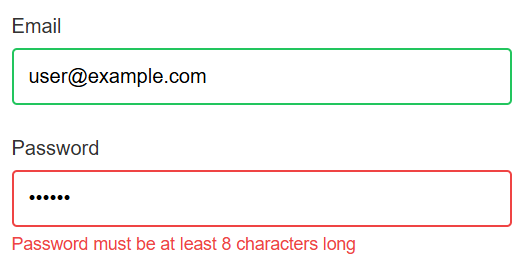
Green and red (filtered via protanopia filter)
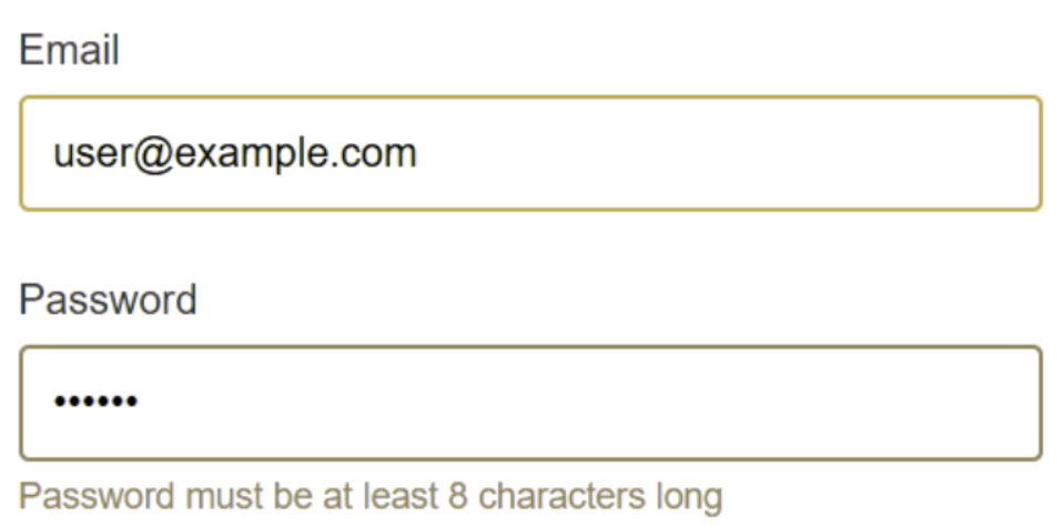
While several colour combinations can be challenging, the examples shown here reflect some of the most significant issues for people with red-green colour blindness. These filtered images were generated using the Coblis colour blindness simulator. Tools like this are useful for early checks and can help you spot potential problems quickly, but they’re only simulations. They cannot replace real-world insight. Whenever possible, we strongly recommend usability testing your designs with actual people.
Greyscale or monotone
Colour blindness usually isn’t obvious when a colour is seen on its own; it’s when colours appear together that the differences become noticeable. One way to design for colour blindness is to avoid colour combinations and instead design in greyscale or a monotone. While this isn't a realistic choice for the majority of interfaces where brand colours exist, it's worth keeping in mind for parts of your design where appropriate.
Lisa Charlotte Muth at Datawrapper wrote a great three-part series on colour blindness. In the final piece, she dives into what it’s actually like to be colour blind and shares practical tips for designing with that experience in mind. Part of that piece includes advice from cartographer Mark Harrower, a big fan of greyscale maps. Harrower gives his students a simple test: if your design still works in greyscale, it’ll probably work for people who are colour blind too. Something else Mark suggests is "single hue colour ramps", which focus on discerning lightness, as opposed to colour combinations.
When in doubt, use blue
When it comes to choosing colours, some hues are generally safer than others. Blue is often considered the most distinguishable colour for people with red–green colour blindness. Using blue for elements such as links or status indicators helps ensure that key information remains visible and distinguishable.
However, it’s worth noting that not all forms of colour blindness are the same. People with tritanopia, a much rarer condition affecting about one in 10,000 people, have difficulty distinguishing between blue and green. For them, blue may not be perceived as clearly. This doesn’t mean you should avoid blue entirely. Instead, treat it as a safer option, not a guaranteed one. And again, always pair colour with another cue, like an icon, text label, or change in shape, so that meaning doesn’t depend on colour perception alone.
Colour blind modes and themes
Designing with colour blind themes in mind is a powerful way to give your audience control and ensure they can customise their experience. This approach is often seen in video games, which may offer different palettes tailored to specific types of colour blindness, such as protanopia or deuteranopia. Some games also include a high-contrast mode, helping people see clearer distinctions between elements. These features show that designers have put thought into how different palettes are perceived by different people.
Go beyond static UI and consider states
Every interactive element (buttons, links, form fields) can have multiple states: hover, focus, active, or disabled. If these states rely solely on colour changes, people who are colour blind may not perceive the difference. A hover state that only changes from light blue to dark blue, or a button that highlights only with a subtle shade, may be imperceptible to many people.
Next steps
For more information about the Web Content Accessibility Guidelines, read our WCAG primer or find out more about how our assessments can help you identify issues in your websites, mobile applications, design systems, and other products and services.