Foundations: link text
Link text tells people where a link will take them or what it will do. When it does that job well, people can navigate content confidently. When it doesn't, people are left guessing or end up somewhere unexpected. Getting link text right creates a more accessible experience for everyone.
The purpose of link text
The purpose of each link should be clear from its link text — ideally on its own, without needing the surrounding context. If that's not possible, the link combined with its surrounding sentence or paragraph should be enough to convey purpose.
Who benefits
People navigate links in different ways depending on the technology and strategy they use. Accessible link text benefits everyone, but in particular:
- People browsing with a screen reader who cannot see listen to links, so descriptive text, rather than "Click here" or "More info", helps people understand where each leads
- People with low vision who browse with screen magnification may only see a portion of the page at a time, so link text needs to be understood in isolation
- People with thinking disabilities who rely on clear, plain language
- People with moving disabilities who browse with speech recognition and activate links by speaking their visible label
Common problems with link text
Vague labels
Avoid link text that is vague and doesn't describe the destination of the link.
Phrases like "Click here", "Read more", "Learn more", and "More info" are the most common problem. This assumes the surrounding context is enough. However, for people browsing with a screen reader, and for anyone scanning a page visually, generic link text is often not enough.
Instead of "Click here" use "Download our accessibility guide (PDF). Instead of "Learn more" use "Learn more about our accessibility training."
Repetitive link text
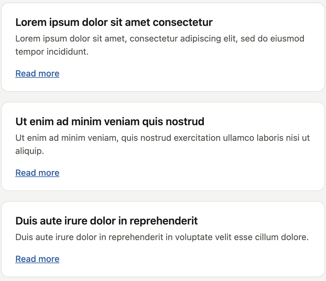
When multiple links share the same label but point to different destinations, it is difficult to know the purpose of a link before clicking it. A list of articles each ending in a "Read more" link is a typical example — there is no way to distinguish one from another without reading the surrounding content.
For example, instead of "Read more" use the name of the target page for example "5 tips for accessible forms — Read more".
URLs as link text
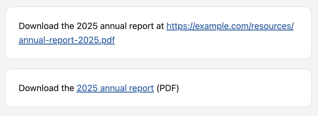
Raw URLs, for example https://example.com/resources/annual-report-2025.pdf, make poor link text. They are difficult to read, verbose when spoken aloud by a screen reader, and give no meaningful information to anyone scanning the page.
For example, instead of "Download the report at https://example.com/resources/annual-report-2025.pdf" use "Download the 2025 annual report (PDF)."
Length
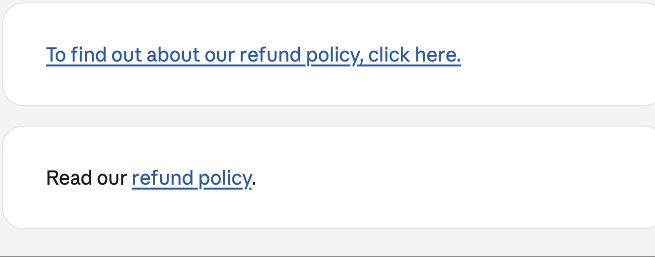
Short link text is easier to scan and easier for a screen reader to speak concisely. Aim for a phrase, not a sentence.
For example, instead of "To find out about our refund policy, click here" link only "refund policy".
Where a link is difficult to describe without context, the link together with the sentence or paragraph around it should be enough for anyone to understand its purpose.
Case
Use sentence case rather than capitalising each word. Title case is unnatural to read and can be slower when spoken aloud.
For example, instead of "Download Our Accessibility Guide" use "Download our accessibility guide".
Colour contrast and focus styles
Links need enough colour contrast against their background, and a clearly visible focus style so keyboard users can see which link is currently selected.
Don't rely on colour alone to show that something is a link. Pair colour with an underline, a change in font weight, or another visual cue, so the link is still identifiable for people who can't perceive colour differences.
Testing link text
The following video guides you through how to check link text.
Transcript
[A dark purple background appears with the TetraLogical logo in the top left corner]
Quick accessibility test: Link text
[The screen fades to a mobile view of VoiceOver settings on iOS]
People who are blind use a software called a screen reader, which reads out all content on the screen for them.
[The Amazon home page loads on a web browser]
When browsing web content with a screen reader, it is possible to access a list of all links on a page, without the surrounding text.
[A dialog box appears called "Links list". All available links are displayed in a list the user can navigate through]
This means that links like "click here" or "read more" provide no useful information. The purpose of such generic links can be difficult to understand for some sighted people too.
[The TetraLogical website loads on the "Articles" page. The user navigates down where links in the page content are brightly coloured, clearly displayed and have unique names]
Check that links on your website are easy to understand for all; read them without the surrounding text and check that they clearly and accurately describe the content they link to.
[The screen fades to the same dark purple as the beginning of the video]
To find out more about accessibility, visit our website at tetralogical.com.
Related standards
The Web Content Accessibility Guidelines (WCAG) 2.2 include two success criteria directly relevant to link text.
More information
- The University of Dundee: Writing accessible link text
- The Home Office User Centred Design Manual: Links
Next steps
Read more accessibility foundations posts, or find out more about our Assessments.