Quick accessibility tests anyone can do
These 10 quick accessibility tests can help you understand how easy or difficult it is for people with disabilities to perceive, operate and understand content on your website or mobile app. The tests are helpful for anyone wishing to get an idea of a product's support for accessibility, including project managers, content editors, procurement managers, and many others.
The tests can be done in a few minutes without testing tools or specialised knowledge. While they do not replace the need for a more comprehensive accessibility assessment they can indicate how easy or difficult a product is to use for people with disabilities. For more information about what is involved in an accessibility assessment read accessibility conformance review.
These tests cover three of the four Web Content Accessibility Guidelines (WCAG) 2.1 principles: perceivable, operable and understandable. These are discussed in more detail in our WCAG primer.
You can view the tests below, as well as on the Quick accessibility tests playlist on YouTube or the Quick accessibility tests with British Sign Language (BSL) playlist on YouTube.
Testing if content is perceivable
Accessible products include two key characteristics: conveying information in alternative formats and adapting to people's preferences. This ensures essential information can be perceived by all, including people who cannot see or hear content, or need to modify its visual presentation.
Test 1: captions
If your content contains videos whose audio track conveys information, captions must be available for people unable to hear or understand the audio track. This includes:
- People with hearing disabilities
- People whose first language is not the one used in the videos and want to also read what they hear
- People who don't have a headset and are in a noisy environment
- People in a quiet place who do not wish to disturb others
Identify where there are videos, then check the following:
- Captions (closed or open) are available when the audio track conveys information
- Captions are accurate, for example they match the audio track
- Captions are synchronised with the audio track
Transcript
[A dark purple background appears with the TetraLogical logo in the top left corner]
Quick accessibility test: Captions
[The screen fades to a still of a programme on BBC iPlayer with pale blue captions over a black background at the bottom of the screen]
Captions are used by many people; people who have hearing disabilities, people who are in a noisy environment, people whose first language is not the one used in the video. When captions are not provided, all these people have no access to the information in the audio track.
[The screen fades to show a video player that fades into the TetraLogical logo. The title "Introducing TetraLogical" is displayed under the player]
Check that all videos on your website have captions.
[The user hovers the cursor over the "subtitles/closed captions" icon on the player and enables captions. White text is now visible on a black background]
These can be permanently displayed or be available for people to turn on.
[The video plays soundlessly in the background as the subtitles continue to display]
Checking that captions are accurate and synchronised with the video content is also important; while automated captions can be useful in some situations, they should not be relied on.
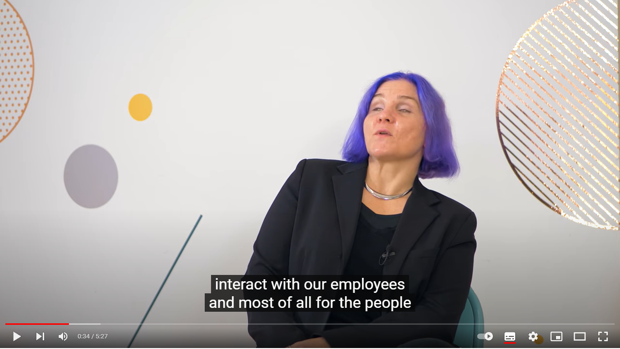
[A video featuring Léonie talking about TetraLogical plays in the background with captions visible on the screen]
To find out more about accessibility, visit our website at tetralogical.com.
An inclusive approach to video production describes approaches to video production that allows you to create accessible videos efficiently.
Test 2: content resizing
People with vision disabilities and older people may need to increase or decrease the text size to read it comfortably. They can do so using the browser zoom functionality or their device accessibility settings. Text must then resize and reflow to fit the screen width, so people are not forced to scroll content horizontally to view it.
Zoom content up to 400% on desktop (for websites) or enlarge the font size in your mobile device settings (for apps), then check the following:
- All text resizes accordingly
- All content remains visible and readable, for example no text overlaps or is truncated
- All content can be viewed without having to scroll horizontally (on websites)
Transcript
[A dark purple background appears with the TetraLogical logo in the top left corner]
Quick accessibility test: Content resizing
[A section of the TetraLogical homepage is displayed with a window open showing various browser settings. The "Zoom" setting is highlighted at 125%]
Zoom is a commonly used feature of all browsers; people zoom in web pages for many different reasons: because they have forgotten their reading glasses, because they are looking at a website on a small screen, or because they have low vision.
The content on your website must resize and reflow as people zoom in.
[The screen zooms out so a large portion of the "Services" web page is visible from the TetraLogical website. The user navigates to the menu and increases the Zoom percentage incrementally so the content on the screen keeps enlarging]
Open your browser menu, find the Zoom functionality and zoom in up to 400%.
[A page from the TetraLogical website is loaded in Chrome, the browser menu is opened and the Zoom level is increased to 400%.
The user navigates down the page. All written content is visible within the window]
Check that all information and functionality remain available and fully legible, and that the content reflows so that there is no need to scroll horizontally to view it.
[All content on the page from the TetraLogical website resizes, remains visible and reflows to fit the screen. It is possible to view all content without having to scroll horizontally.]
Using responsive design is a great way to ensure that content resizes and reflows as expected.
[The screen fades to the same dark purple as the beginning of the video]
To find out more about accessibility, visit our website at tetralogical.com.
Test 3: colour customisation
Many people cannot read text unless it is in a specific colour and against a particular background. For example, people with visual or reading disabilities, such as colour blindness or dyslexia, benefit from customising text and background colour. You want to ensure that your content adjusts as expected to any colour scheme that people may choose to use.
Select a different colour scheme in the device settings, then check the following:
- All text adapts to the selected colour scheme
- All text is still visible
Transcript
[A dark purple background appears with the TetraLogical logo in the top left corner]
Quick accessibility test: High Contrast mode
[The macOS system preferences for accessibility are displayed in a window. The user is on the "Display" settings where a variety of options are available]
All devices have an option to change the colour of text and background; this is because many people find it easier to read text when it's in a particular colour, against a specific background.
[A Google search result page is shown with the background colour as black, links in bright yellow, and paragraph text in white]
For example, many may prefer to read white text on a black background.
[The page content stays the same but the colours change. The black background turns to light blue, the link text changes to a dark blue and paragraph text is now grey]
Others, grey text on a light blue background.
Websites and apps must adapt and remain usable in all colour schemes. Check if colours on your website can be customised.
[The screen changes to the TetraLogical homepage in the background as the user opens the Windows settings menu]
If you have a Windows machine, find the High Contrast option under Ease of Access in Settings and turn it on.
[The same happens on macOS as the user opens the "Systems Preferences" settings and navigates to "Accessibility"]
You can do the same on macOS by selecting the Invert Colors option under Display in the Accessibility settings.
[The TetraLogical homepage is displayed again, but the colours have inverted. Links are now bright yellow]
At this point, all text except for links should be white on a black background.
[The user navigates down the page where all content is displayed as intended]
Next, check that the content is still fully visible and understandable. For example, check that no informative images have suddenly disappeared from the page and that buttons are still recognisable.
[The screen fades to the same dark purple as the beginning of the video]
To find out more about accessibility, visit our website at tetralogical.com.
Test 4: visual presentation of links
Links offer people an easy way to navigate content and find the information they want. When links are identified using colour alone, some people may struggle to notice them, for example:
- People unable to perceive some or all colours
- People using an app in a very sunny or bright place
- People using an app in a dim environment
Using an additional visual cue, such as an underline, can help all sighted people find them.
Identify where there are Links, then check the following:
- They are identified via an underline or other visual cue
Transcript
[A dark purple background appears with the TetraLogical logo in the top left corner]
Quick accessibility test: Visual presentation of links
[A block of black text appears, displayed on a white background. Certain words are coloured in a blue hue]
Links are often displayed in a different colour from static text, so that people can recognise them. However, not all people can perceive differences in colour.
[The text transforms to be completely uniform black writing]
Some have visual disabilities that impact colour perception.
To make it easy for people to recognise links, an additional visual cue should be used to differentiate them.
[The text changes back to the first version with the blue wording, except those words now have an underline]
A permanent underline is a common way to identify links, and can be perceived by all sighted people. Other visual cues can also be used, such as an icon next to links.
[The user navigates through several pages on the TetraLogical website. All have clear links, underlined and in a bright purple colour, that makes them easy to perceive]
Go through your website and check that links are not just identified by colour, but that they also have an additional visual cue.
[The screen fades to the same dark purple as the beginning of the video]
To find out more about accessibility, visit our website at tetralogical.com.
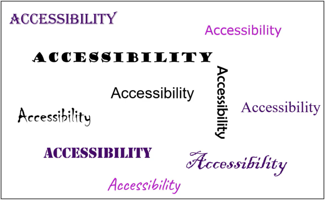
Test 5: text legibility
The fonts, styles and alignment can have a huge impact on the readability of text for some people. While there are no set rules around text fonts and alignment, simple and commonly used fonts and left-aligned text are easier to read. Styles such as bold, italic and all capitals can decrease text legibility, especially if used for long blocks of content.
Identify headings, paragraphs, lists, labels and other text, then check the following:
- Simple and common fonts are used
- Text is left-aligned
- Bold, italics and capitalised text is used sparingly
Transcript
[A dark purple background appears with the TetraLogical logo in the top left corner]
Quick accessibility test: Typography
[A white screen with the word "Accessibility" written multiple times appears. Each word is a different font, size, colour, or orientation]
Text formatting plays an important role in making content easy to read for all.
[Three words are highlighted in quick succession, each one in a clearly legible font]
While each person has their own preferences, simple and commonly used fonts are easier to recognise and read, as is left-aligned text.
[The TetraLogical "Articles" page appears on a browser and the user starts to navigate down the page]
Check that only a few simple fonts are consistently used across your website, and that text on all pages is left-aligned.
Also, check that bold, italic and all-capital text is not used for long blocks of content, as they can have a negative impact on content legibility.
[The screen fades to the same dark purple as the beginning of the video]
To find out more about accessibility, visit our website at tetralogical.com.
Testing if content is operable
Not everybody can or wants to use websites with a mouse or mobile apps with gestures. Many prefer, or need, to use alternative input methods. These include keyboards, mouth sticks, eye tracking, speech recognition, and much more. With so many different input devices available, checking support for everything may seem daunting. Luckily, the way most input devices interact with digital content is relatively similar. By ensuring content works well with a keyboard, you can be reasonably confident they will offer good support for other input devices.
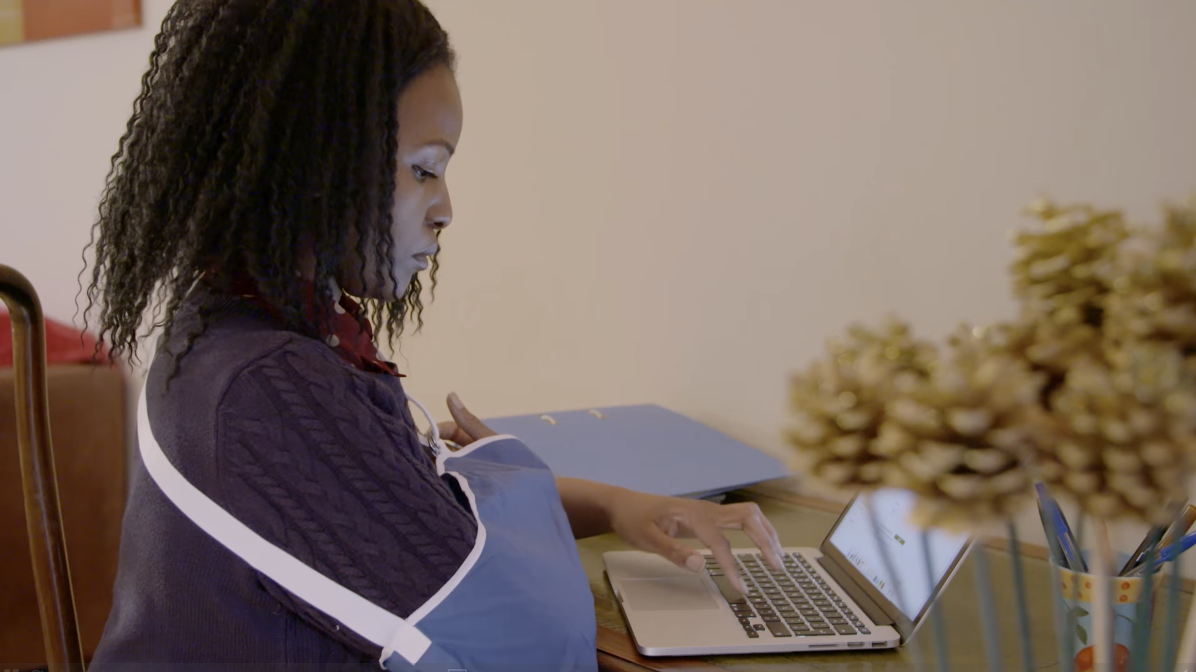
Test 6: keyboard support
Check that it's possible to navigate content using the keyboard alone. This means you can reach and activate all actionable elements such as buttons, links and controls. The order in which those actionable items are reached must also be logical, or people may become disoriented. If testing on mobile, you can connect a bluetooth keyboard to ket keyboard support.
Other issues experienced by keyboard users are the lack of a visible indication of their current location on the screen and the inability to interact with components using standard navigation and activation keys.
 (Credit: WAI Perspectives: Keyboard Compatibility)
Using a keyboard navigate content and check the following:
- All buttons, links, form fields can be accessed using the Tab key
- All buttons, links, form fields can be activated using the Enter or Spacebar key
- All buttons, links, form fields have a visible focus state
- The content order is logical
Transcript
[A dark purple background appears with the TetraLogical logo in the top left corner]
Quick accessibility test: Keyboard support
[An image appears of a person in a lab coat typing on a black keyboard]
Many people are unable to use a mouse or touch gestures due to limited arm movement and dexterity issues. Instead they may rely on a keyboard, or similar input device, to navigate and operate digital content.
[The TetraLogical "Services" page fades into view]
To find out if your website is keyboard accessible, load the site, and start navigating it by pressing the Tab key on your keyboard.
[A purple "Skip to main content" button appears at the top of the screen. As the user navigates, the visible focus indicator moves through the links]
You should be able to reach all actionable controls, such as links, buttons, and form fields.
Pressing the Enter key or Spacebar should activate these controls.
[A link on the page from the TetraLogical website is activated with the Enter key and a new page is loaded]
If any actionable element on your website is skipped, receives the focus in an illogical order, or you cannot see where the focus is at any time, then keyboard support is not properly implemented.
[The screen fades to the same dark purple as the beginning of the video]
To find out more about accessibility, visit our website at tetralogical.com.
Browsing with a keyboard discusses how keyboard users experience the web.
Test 7: skip links
People using keyboards, sip and puff devices, joysticks, head pointers and similar input devices navigate pages sequentially: from the first item at the top to the last one at the bottom. Sometimes this results in people having to press a key or button many times before reaching the content they want. This is why skip links, which allow people to skip entire content sections, are helpful, especially on pages with large navigation menus. Skip links should be the first items on every page and always visible or become visible when they receive focus. "Skip to main content" is the most commonly used editorial.

Identify is skip links are available on your website, then check the following:
- The skip link is available at the top of the page in the keyboard tab order
- The skip link can be activated using the Enter key
- Focus moves to the right section of content
Transcript
[A dark purple background appears with the TetraLogical logo in the top left corner]
Quick accessibility test: Skip links
[A webpage is displayed with various menu options and a drop down arrow next to each one. The option titled "Sending" has been expanded and is displaying fourteen different links over two columns]
For people navigating websites with the keyboard, having to go through a large number of links before reaching the main content of the page can be tiring. For people with motor disabilities who use specialised input devices, this can be even more of a barrier.
[The TetraLogical homepage comes into view. It darkens as a purple button with the wording "Skip to main content" is highlighted]
Skip links offer people a way to skip entire sections of repeated content, and to quickly reach the main content of the page. Easy to implement, they can be visible on the screen by default, or they can appear when people start navigating a page with a keyboard or similar input device.
[The Google homepage appears in the browser. The user navigates to the address bar and loads the TetraLogical homepage. Almost immediately, the purple "Skip to main content" button appears at the top of the page]
Check if your website contains skip links by pressing the Tab key on your keyboard after loading a page. A "skip to main content", or a similar link, should appear on the screen.
Next check that the link works as expected. Press the Enter key and check that the focus moves to the main content area.
[As the link is activated, the screen jumps down and the keyboard focus becomes visible around the main content area]
Now, if you press the Tab key again, focus should move to the first actionable item in the main content.
[The focus moves to the first link in the main content area of the TetraLogical page. The screen then fades to the same dark purple as the beginning of the video]
To find out more about accessibility, visit our website at tetralogical.com.
Testing if content is understandable
Ensuring information is easy to understand is essential for everyone, particularly for people with situational, temporary or permanent cognitive disabilities. For example, someone with a learning disability may struggle to understand sentences, or someone with a migraine may find concentrating difficult. Content designed and written following accessibility best practices is easier to comprehend for everybody.
Test 8: content structure
A logical content structure is one of the ways you can improve its readability and understandability. Long blocks of content with no structure are more challenging to understand than brief sections preceded by a descriptive heading. Information presented in bulleted or numbered lists is also generally easier to comprehend. Finally, prioritising content and calls to action at the beginning of each page, screen, or section helps people notice them.
Identify different page/screen content and layouts, then check the following:
- Content is broken down into brief sections, each preceded by a descriptive heading
- Bulleted and numbered lists are used when appropriate
- Key information and calls to actions are prioritised in the content order
Transcript
[A dark purple background appears with the TetraLogical logo in the top left corner]
Quick accessibility test: Content structure
[A simple webpage appears with a heading in a dark purple banner and content below. Each section is labelled so the "Page main heading" and "Section headings" are titled as such, followed by a paragraph below. A "Main call to action" button is clearly marked and related links are listed to the left of the screen]
Content that is well structured is easier to read and understand for all, and in particular for people with cognitive and reading disabilities.
Good content structure includes: breaking down content into short sections, each preceded by a clear heading; using list format when appropriate; and placing important information at the beginning of the content.
[The TetraLogical web page appears and the user navigates down the "Knowledge" page where text is clearly laid out and easily legible]
Navigate your website and check that pages don't contain long blocks of text with no structure, and that enough prominence is given to the most important information and calls to action.
[The screen fades to the same dark purple as the beginning of the video]
To find out more about accessibility, visit our website at tetralogical.com.
Browsing with desktop screen readers and mobile screen readers discusses how people navigate content structure including headings.
Test 9: link text
People should not have to activate links to know what content they load. All links should be descriptive enough for people to understand their purpose, for example, "read all UK news" and "how to register" are clear. Vague links such as "click here" or "read more" are not and should be avoided. Avoid using a URL as link text; they are difficult to read and process for everybody. For links that load content other than web pages such as PDF, including the content format is good practice. For example, "Annual report 20-21 (PDF)" rather than "Annual report 20-21".
Identify links within your content, then check the following:
- Links provide you with enough information to know what content they load confidently
- Generic link text such as "read more", "click here" or similar is not used
- A URL is not used as link text
- Links that load PDF or other documents include the file format
Transcript
[A dark purple background appears with the TetraLogical logo in the top left corner]
Quick accessibility test: Link text
[The screen fades to a mobile view of VoiceOver settings on iOS]
People who are blind use a software called a screen reader, which reads out all content on the screen for them.
[The Amazon home page loads on a web browser]
When browsing web content with a screen reader, it is possible to access a list of all links on a page, without the surrounding text.
[A dialog box appears called "Links list". All available links are displayed in a list the user can navigate through]
This means that links like "click here" or "read more" provide no useful information. The purpose of such generic links can be difficult to understand for some sighted people too.
[The TetraLogical website loads on the "Articles" page. The user navigates down where links in the page content are brightly coloured, clearly displayed and have unique names]
Check that links on your website are easy to understand for all; read them without the surrounding text and check that they clearly and accurately describe the content they link to.
[The screen fades to the same dark purple as the beginning of the video]
To find out more about accessibility, visit our website at tetralogical.com.
Test 10: page titles
Page titles, displayed on the browser tab when pages loads, are key for many people. It is the first piece of information screen reader users hear when navigating to a new page and the only information visible when multiple tabs are open in the browser. It reassures people they have landed on the right page and reminds people with memory loss what page they are on. Ensure all pages in your website have a unique and descriptive title. A descriptive title should also be in the header of mobile app screens.
Identify page titles, then check the following:
- Web page titles describe the unique content of each page
- Screens in mobile apps have a unique and descriptive title
- Titles start with the page or screen name, for example, "News - TetraLogical" instead of "TetraLogical - News"
Transcript
[A dark purple background appears with the TetraLogical logo in the top left corner]
Quick accessibility test: Page titles
[A browser comes into view displaying the TetraLogical homepage. The screen darkens as five open tabs are highlighted, each one showing the title of a different webpage]
The page title is the first piece of information announced by screen readers when a page loads. It's also the only information visible when multiple tabs are opened in a browser. Accurate page titles remind and reassure people of their current location on a website; generic ones can confuse and frustrate people.
[The user navigates through various pages on the TetraLogical website. Each one has a unique title that matches the page content]
Load a few pages from your website and check that an accurate and clear title is visible on the browser tab or the browser's title bar. Each page should have a unique title that briefly and precisely describes its content.
[The screen fades to the same dark purple as the beginning of the video]
To find out more about accessibility, visit our website at tetralogical.com.
Summary
Performing these 10 quick accessibility checks helps you to identify key accessibility issues with your content. Anyone can use them as part of an initial product review to raise awareness around the needs of people with disabilities and help build a business case for accessibility.
Next steps
Learn about how people with disabilities browse with assistive technologies or how our Consultancy service can help you achieve sustainable accessibility.
Updated Thursday 2 March 2023.