Designing accessible documents
Designing accessible documents means considering the needs and preferences of all people from the start. When documents are well-designed, they are easier to read and navigate for everybody.
Inaccessible documents can exclude people with seeing, hearing, moving, or thinking disabilities from essential information. Making documents accessible ensures everyone can access the same content.
This guide focuses on practical design considerations for inclusive digital documents. The principles apply across formats, whether you are working in Word, PDF, or EPUB.
Design considerations
Accessibility is not something to add at the end of document design. Decisions about structure, layout, language, and formatting all affect how easily people can use a document.
Content structure
When documents have long blocks of unstructured text, it makes the content difficult to read and understand for many people. An unclear structure increases cognitive load for everyone as it can be tiring to decipher dense blocks of text. It is especially difficult for people with cognitive disabilities, people with low vision, and people browsing with a screen reader.
Structuring documents using headings, clear layout, and accessible data tables makes them easier for everyone to scan and read. It is important to use the formatting tools provided by your authoring tool, rather than relying only on visual styling to show structure. People using screen readers rely on this programmatic structure to navigate content quickly and understand how it is organised.
Well-structured documents follow these guidelines:
- Prioritise: start with the most important content
- Structure: break content into brief, logical sections
- Focus: use one idea per section
- Group: place related ideas together under a descriptive heading
- List: use formatted lists for important points to break up content
Headings
Splitting content up using headings helps people scan the page and find information quickly either visually or when browsing with a screen reader using keyboard shortcuts.
It is also important that headings clearly describe the content that follows so people who have reading disabilities can predict what each section contains.
A good heading structure is especially important for people using screen readers. Screen readers announce headings and allow easy navigation of content by headings alone. If headings are missing, incorrectly ordered, or created using visual styling alone, this navigation breaks down.
Good heading practice includes:
- Formatting: use built-in heading styles rather than styling text with bold
- Structure: follow a logical order, for example Heading 1 followed by Heading 2, without skipping levels
- Clarity: write headings that clearly describe the content that follows
Layout
Accessible documents use a simple layout.
One column of text is not only easier to read but also easier to make accessible than documents with complex layouts with multiple columns.
When documents have a simple layout, it means content flows logically from top to bottom, left to right (in western languages). This helps create a logical reading order for people browsing with a screen reader or other types of assistive technology that rely on a programmatic reading order, rather than visual layout. When content is structured incorrectly, it can become nonsensical when announced by screen readers.
Issues with reading order often occur when documents are heavily designed with integrated images and are created in design tools with layers such as Adobe InDesign.
When these files are exported or converted into a fixed format such as a PDF with columns or complex layouts, screen readers will attempt to read this content from top-to-bottom and left-to-right, resulting in text announced across columns and out of order.
To create an accessible layout:
- Simplicity: avoid complex multi-column layouts
- Structure: structure content in an order that preserves meaning; for example, section heading, section text, a related image and caption text
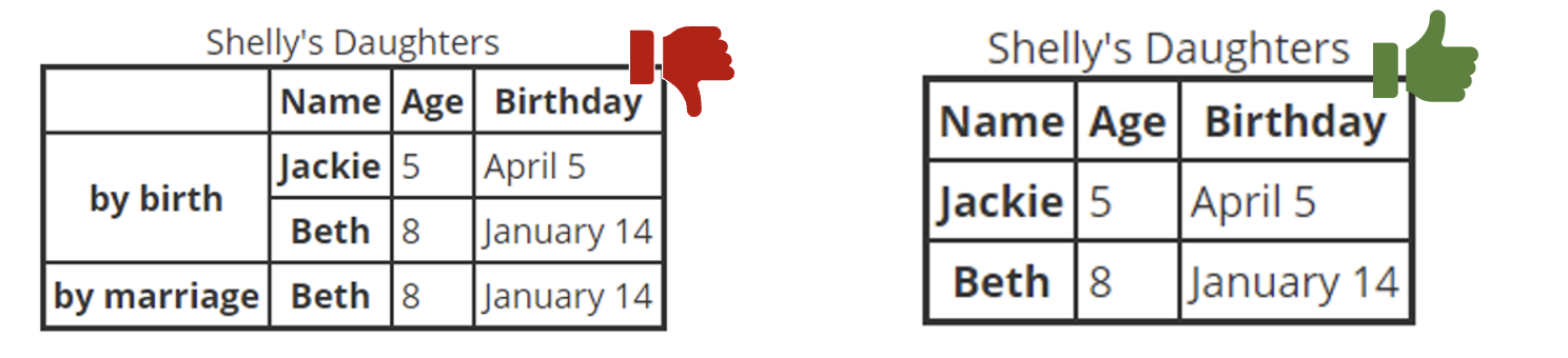
Tables
Tables should only be used to display data. When tables are used for layout rather than expected tabular data, it can be misleading to people navigating by screen readers.
Keep tables simple. Complex tables with multiple rows and columns of header cells, or merged and split cells, make it harder for everybody to understand. People with cognitive and visual disabilities can find complex tables particularly problematic.
Tables should be structured correctly. People using screen readers rely on properly formatted table headers to understand table context. When table headers are marked up properly, screen readers can identify the relationship between headers and data cells, helping people understand the information and navigate the table more effectively.
Displaying a table caption above a table helps give context to people using screen readers before they navigate into the table structure. If the table is large or complex, the addition of a brief text summary before the table can also help everyone understand table content better.
Good table practice includes:
- Purpose: use tables only for data, never for layout
- Formatting: use formatted table headers cells and data cells where possible
- Structure: only use one row/column of headers
- Simplicity: break up out complex tables into smaller, simple tables
- Clarity: avoid merged or split cells
- Context: display a caption and a brief text summary before tables
Document metadata
When assistive technologies first interact with a document they refer to the file information set out in the document metadata to interpret the document. Metadata, such as a document title or language, allows people who use assistive technology to identify and interpret documents with ease.
Title
An important way to introduce your document is with a clear, descriptive title. A descriptive title helps people understand what the document is about before reading it. Without a proper title, people may need to explore the document just to work out what it contains.
Screen readers announce the title first when opening a document. As people using screen readers cannot see the page content before opening, they rely on a descriptive title for context.
A good document title is:
- Descriptive: the title describes the purpose or topic of the document
- Programmatic: the title is set using the document’s title or metadata options
Document language
All documents should have a defined language, where possible.
Screen readers use the document language to determine pronunciation. If the language is missing or incorrect, content can be misinterpreted and impossible to understand.
To accurately define a document's language:
- Set the correct default language of the document in the authoring tool settings
- Identify language changes within content where needed
Navigation
Navigation mechanics helps everybody navigate longer documents with ease. This reduces fatigue and frustration for everybody but is especially important for people with motor disabilities who cannot scroll through long documents. People with cognitive disabilities may also prefer to jump directly to relevant sections rather than reading content linearly from start to finish.
A table of contents in long documents over 10 pages or containing multiple sections, helps everyone quickly navigate to a specific section. Documents provided in PDF or EPUB format also have additional mechanics to provide system-level contents navigation that can be easily accessed when reading within document reading software. Page numbers and sections not only provide reference points for a table of contents but help people with cognitive disabilities keep track of their location within a document.
Navigation mechanics include:
- Internal table of contents: provide a linked table of contents at the beginning of the document
- Referencing: use page numbers and sections
- System-level navigation: where possible, add system-level navigation such as bookmarks in a PDF document and a
navfile (nav.xhtml) in an EPUB file
Language and formatting
Language and formatting choices are essential in helping everyone, especially people with reading disabilities, understand your document content. Text formatting is the use of styles such as headings, bold text, lists, spacing, and alignment to organise and present content clearly. Plain language is the use of small, simple words that can be understood by everyone.
Link text
Link text must clearly describe the purpose of the link, ensuring its understandable even if read out of context. If links don't succinctly and clearly describe their purpose, it can make it confusing for people navigating with screen readers to know where the link will lead. When links are left as long URL strings, they can be tiring to listen to as they are often announced by screen readers character by character.
People using screen readers also often navigate documents using a list of links. If links are vague, such as repeated instances of "click here", it makes navigation difficult.
To write accessible link text:
- Describe purpose: link text should clearly and succinctly describes where the link goes
- Use real text: avoid using URL strings as link text
- Be descriptive: avoid generic phrases such as “click here” or “read more”
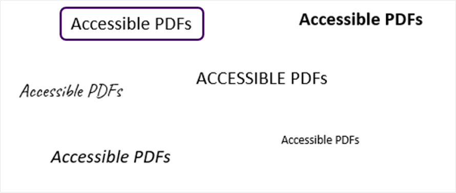
Formatting and text style
Formatting choices in document design have a significant impact on readability. People with reading disabilities such as dyslexia, low vision, or cognitive disabilities can be particularly affected by poor formatting. Good formatting and text styling is essential for cognitive accessibility. Clear, legible fonts and left aligned text reduces visual and cognitive strain for everyone.
In addition, good formatting supports magnification, reflow and personal display preferences. Formatting choices such as centre aligned text or overuse of bold or italic text can make text more difficult to read at larger magnification sizes.
Good formatting practice includes:
- Font choice: use a readable sans-serif fonts such as Arial or Helvetica
- Text size: set document text to a minimum of 12 pt
- Text alignment: left align text to avoid inconsistent text spacing
- Spacing: line height should be set to 1.5 times the text size and paragraph spacing should be set to two times the text size
- Legibility: avoid styling text bold, italics, or ALL CAPS to keep text readable, only underline links
Plain Language
Using clear and plain language benefits everyone. Plain language is simpler to read and understand, reducing cognitive load for all, including people with a high level of education. It is particularly important for people with cognitive and reading disabilities or people reading in a second language.
Plain language helps people understand and process information quickly. Only use technical terms if the document is intended for an audience familiar with technical terms, such as a medical journal.
To use plain language in documents:
- Be succinct: keep sentences and paragraphs short (around 20 to 25 words per sentence)
- Keep it simple: Use simple words, avoid unnecessary jargon
- Expand acronyms: if you must use acronyms or abbreviations, write their expanded version the first time you use them
- Use an active voice: use sentences where the subject performs the action described by the verb (“I ate the cake”).
- Use verbs rather than nouns: “We discussed the importance of accessibility” instead of “We had a discussion about the importance of accessibility”.
Readability
Readability and reading age tools can help assess how easy content is to understand. Supporting lower reading levels increases inclusion for people with cognitive disabilities. It also makes content more understandable for people reading in a second language or for people who don't have a high level of education.
The average reading age for adults is often around nine to 11 years old. To make your content understandable to as wide an audience as possible, the reading age of document content should aim to be around nine years old.
One common tool to assess the reading age of text content is the Hemingway Editor. Input text should aim for Grade 4 or lower, which is roughly nine year old reading age.
The Flesch Reading Ease score is another common means of assessing readability. It is available in tools such as Microsoft Word. A score of around 70 or higher indicates content that is easier to read for a wide audience.
When writing document content, use the following to assess readability:
- Reading age: aim to write for a 9-year-old reading age, even if you are writing technical content
- Hemingway Editor: aim for Grade 4 or lower
- Flesch Reading Ease score: aim for a score of around 70 or higher
Images
Images are a valuable tool for facilitating understanding in digital documents. Having an image or graph as an alternative to text can help many people, especially people with cognitive disabilities, better understand complex text content.
However, when used without thought, images can be a barrier to access for many people. Before selecting an image, consider whether it is really needed and if there is no other way to get that content across. As not everyone can perceive the images, avoid referencing the content in images if the same information is not available in text.
Text descriptions
Informative or meaningful images are images that provide meaning that is not otherwise available in text. If the image is meaningful you must provide a text description.
Text descriptions should be added through the alternative text field in your authoring tool.
If an image does not convey any additional meaning, it is a decorative image. Document authors often use images for decorative purposes, such as an illustrated border. It is important to mark these images as decorative in the authoring tool to appropriately to hide the images from screen readers.
Text descriptions should:
- Be concise: keep descriptions short and to the point, aim for 1–2 sentences
- Be descriptive: describe the purpose of the image, only convey necessary details
- Consider context: consider the context of the image; the same image may have a different text description depending on how it is used
- Avoid repetition: don't repeat information already available in nearby text
- Be meaningful: avoid describing decorative images, these should be marked as decorative in the authoring tool
- Describe purpose: explain the destination or purpose if the image is being used for a button or link
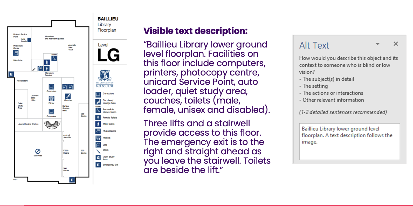
Complex images
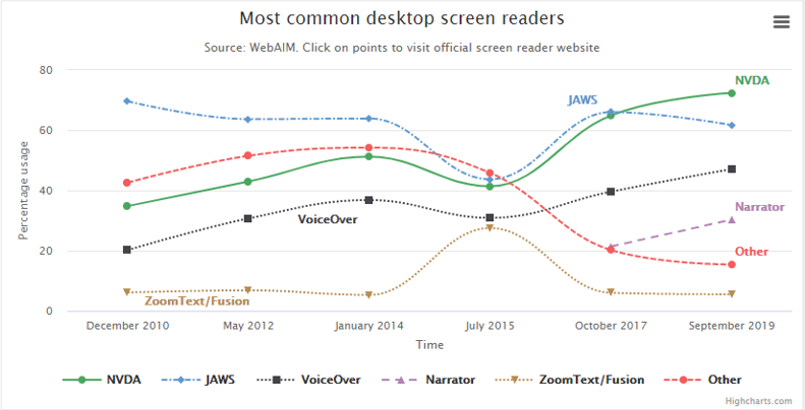
Complex images — such as charts, maps, diagrams and flowcharts — often require more detailed description. Complex graphs and charts can be difficult to understand for many, such as people with certain cognitive disabilities. People with low vision may also struggle to perceive meaningful information contained within them.
Long descriptions are a more detailed description than a standard text description provided in text. They should be used if the image provides meaningful information that cannot be fully described in the text description and which is not already described in nearby text.
Where text descriptions should be no more than one or two sentences, long descriptions can be any length. Unlike text descriptions, as long descriptions are written in visible text, they may contain lists and tables. For complex graphs, it can be helpful to display the same information formatted within a data table.
For complex images:
- Summarise in a text description: provide a brief summary of the chart content in the authoring tool alternative text field
- Describe in detail: write a more detailed long description in visible text
- Associate with the image: place the long description close to the image or add a link in the image caption to the long description location
Colour
Similar to images, when colours are used appropriately they can help people quickly identify information. This reduces cognitive load for everyone, including people with cognitive disabilities. However, many people, such as people with low vision or people who use screen readers cannot see the difference between certain colours or perceive colour at all.
Use of colour
Conveying information through colour alone makes it inaccessible to people who cannot perceive differences in colour. For example, instructions such as “fields in red are required”, are unhelpful to people who cannot perceive the colour red.
When colour is used to visually distinguish links from their surrounding text, a secondary indicator, such as an underline, must also be used to visually convey the information. When colour is used to convey a state, such as success, failure, high, medium or low, then a second indicator, such as an icon, must also be used.
Use of colour should be considered in:
- Links: use a secondary visual indicator for links, such as an underline
- Non-text content: use a secondary indicator such as patterns, text, and icons alongside colour in charts and maps
- Instructions: avoid referencing colour alone as an instruction, status indicator or means of highlighting information
Colour contrast
Providing sufficient contrast on all meaningful document content is essential for people with low vision. Strong contrast improves readability for people with low vision and for all people reading in challenging conditions, such as bright sunlight.
All meaningful text must provide enough contrast against background colours, including text within images and text overlaying a gradient background. Meaningful non-text content such as icons, diagrams and information within charts and functional images must also provide enough contrast against adjacent colours.
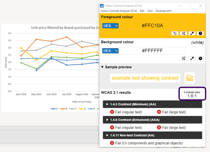
To find the colour contrast ratio between colours, use a colour contrast checker tool such as TGPI Colour Contrast Analyser (CCA).
Meaningful document content must follow colour contrast guidelines:
- Normal text: all text must have a minimum contrast ratio 4.5:1 against its background
- Large text: all text that is 18pt or 14pt and bold must have a contrast ratio of 3:1 against its background
- Non-text content: all icons, diagrams and other non-text content that conveys information must have minimum contrast ratio of 3:1 against adjacent colours
Summary
Ensuring that your documents are accessible is not just a legal requirement, it's necessary to ensure people with disabilities have equal access to your digital documents. Most document accessibility issues are the result of everyday design and content decisions.
By considering accessibility from the beginning of designing your document, you improve usability for everyone and support legal compliance by default
In the next post in this series, we’ll start at the source and explore how to apply these foundations in Microsoft Word.
Resources
- Inclusive Design Principles
- WebAIM: Semantic structure
- Tink: Understanding semantics
- TGPI Colour Contrast Analyser (CCA)
- Hemingway Editor
- 4 Syllables: Designing scannable content
Next steps
If you already have published documents hosted online, our assessments can help you to understand whether your products and services meets accessibility standards.