Foundations: target sizes
Posted on by Joe Lamyman in Design and development
Tags: Foundations, WCAG
A target size is the area that can be activated in order to interact with an element. For people who have dexterity issues, the smaller a target size is, the more difficult it may be to use the website.
This post explores how to create usable, consistent, and well-spaced target sizes.
A person's ability to click or tap smaller controls may also be affected if they have a disability or a combination of disabilities that affect their dexterity and motor movements, or if they are moving while using a website, be it while walking or using transport.
There are many ways that people may interact with a device in order to operate it.
Beyond using a mouse, people may use alternative pointing devices such as a large trackball mouse, joystick, and eye or head pointer software that uses a camera to detect specific movements. These alternative devices all benefit people with different disabilities like arthritis, cerebral palsy, and tremors, for which the design of a typical mouse may be difficult to use.
It's also not only smartphones with touch screens that people may interact with by touch. Tablet devices, laptops, and monitors can all offer touch interactions, or the use of a stylus which works similarly.

It's not possible to determine or predict exactly how a person may interact with the designs that we create. The way that a person uses a design may change throughout their usage. Recent additions to the web mean that we can try to detect how people may be interacting with their devices. However, assumptions about interaction methods can be problematic, as they may not be accurate and changes to the sites design made on incorrect assumptions can lead to a worse user experience.
The best solution is to create large and well-spaced target sizes so that people can easily click or tap the control they want and have a better experience regardless of how they use their devices.

Creating usable target sizes
In the Web Content Accessibility Guidelines 2.1, the only requirement for target sizes and spacing is 2.5.5: Target Size, which is for AAA compliance. The guideline requires that a target size is no smaller than 44 pixels by 44 pixels. This success criterion applies to all pointer inputs, such as mouse, stylus, and touch.
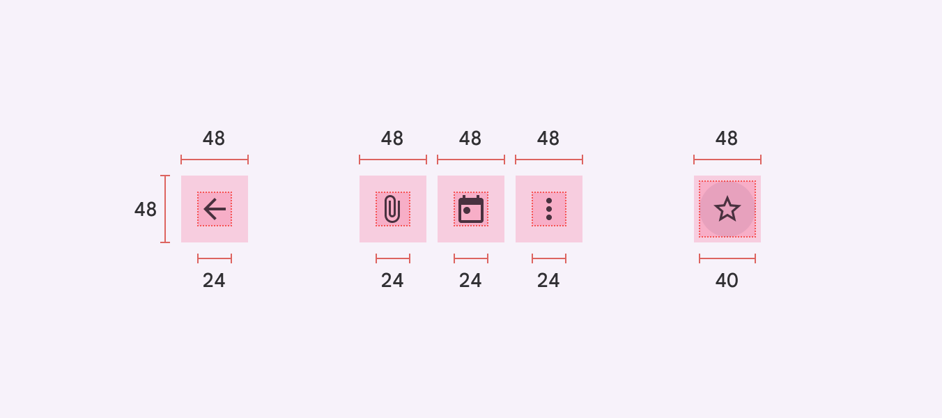
Both Apple's design guidelines and Google's material design guidelines have similar recommendations. Apple's layout guidance recommends that components "maintain a minimum tappable area of 44×44 points for all controls". Material design recommends that target sizes are at least 48dp by 48dp. The icon for the control does not have to be the full size, but can use padding to increase the visual space, all of which can be clicked or tapped.

The WCAG guideline for a target size of 44 pixels by 44 pixels is the minimum required and depending on context of use, people may require larger target sizes. An example of this in practice can be found in Google's Design for Driving guidance, used for designing interfaces in cars. The Design for Driving sizing recommends a much larger minimum touch target size of 76dp by 76dp. The larger size is used "to be glanceable and easily selected by a driver while the car is in motion". The target area size has been made larger to better meet the needs of people using the controls by considering their situation and environment.
At the moment, it's not possible to create content that is sized using physical measurements like millimetres (mm). This is because different devices are sized differently and have different pixel densities and display resolutions. Physical measurements such as mm used in CSS are not guaranteed to be displayed accurately, as they are still anchored and defined in terms of CSS pixels. Because of this, you will notice that different platforms use different measurements for target sizes:
- W3C provides guidance in terms of density-independent CSS pixels (px)
- Apple provides sizes in points (pt)
- Google in density-independent pixels (dp)
Follow the guidance for minimum recommended sizes and test them with people using your software and services, including people with disabilities, to ensure that they work for your target audiences and their varying needs.
Spacing between controls
As described earlier, often padding can be added around icons to make the target area bigger and easier to operate.
Spacing between controls can also affect how easy it is to click or tap the right control. Too little spacing means that people may accidentally activate a control that they did not mean to. In some cases, this may not be a problem, but in other cases accidental activation of controls can be problematic and lead to anxiety for people using the site.

The BBC's How to design for touch article builds on this and recognises that some controls may not meet their 44px by 44px tap target area size. If this is the case, spacing or "exclusion zones", can be added around a control to keep the space clear and make it easier to click or tap the right control.

When changing spacing, if controls are related, make sure that this visual relationship is not affected by implementing too much spacing. The Spacing article from the IBM Carbon Design System describes relationships and spacing as being closely related:
Elements in a design that are near each other are seen as being meaningfully related. As more space is added between elements, their perceived relationship weakens.
Consistent targets and spacing size
Once agreed on, spacing and target sizes can then be introduced into accessible design systems to ensure that all components are consistent. Similar to the way you would document focus states in a visual style guide, minimum target area sizes can also be documented and the spacing between components can be displayed to make it clear for developers how to implement patterns.
The "be consistent" Inclusive Design Principle describes how consistency can improve people's experience with your websites. Consistent patterns and components make it easier for people to understand how to interact with the site and to activate the controls that they want to. Consistency across all components and pages ensures that people do not have to relearn how to use your website.
If your target sizes are both consistent internally (across your website) and they match other guidance (like WCAG), people will be able to comfortably interact with the website and feel confident in doing so.
Check target sizes
You can check the target sizes during the design stage and during implementation.
When designing prototypes, tools such as Figma will display the dimensions of elements. Select the control to view its size. Ensure that you factor in any spacing between controls. Using Figma, on Mac press the Option key or on Windows press the Alt key, and then hover over another element to view the spacing between elements.

When implemented, you can check target sizes using your browser's development tools. Using Chrome as an example, either right click and select "Inspect", or in the settings menu, select "More Tools" and then "Development Tools". With the development tools panel open, you can navigate through the list of HTML elements, or select an element with the mouse. With an element selected, you'll be able to view the size of the control. Again, make sure to take into account any spacing between controls.

Tips for target size
- Make sure that controls are appropriately sized and spaced
- Test the size of controls with your audience, including people with disabilities
- Implement spacing and target sizes consistently
Proposed success criterion
At the time of writing, there is a proposed WCAG 2.2 Level AA success criterion that relates to target areas: Target Size (Minimum).
In general, it requires that the target size for controls are at least 24 CSS pixels by 24 CSS pixels. However, it does allow for targets that are smaller, as long as their 'offset' (which the Success Criterion defines as the size of the target, plus its spacing to any adjacent targets) is at least 24 CSS pixels. There are also a handful of exceptions for where the minimum size does not apply, such as if the size of the target is determined by the user agent and has not been changed, or if the target is in a sentence or block of text.
However, this is not currently a W3C Recommendation and the inclusion of the criterion may change before release of WCAG 2.2.
Update: in the most recent (May 2023) editor's draft for the upcoming WCAG 2.2, the proposed Target Size (Minimum) has been considerably reworked. Instead of the original idea of 'target offset', the spacing exception now defines the minimum space between targets using circles:
Undersized targets (those less than 24 by 24 CSS pixels) are positioned so that if a 24 CSS pixel diameter circle is centered on the bounding box of each, the circles do not intersect another target or the circle for another undersized target.
Ideally, targets should have dimensions of at least 24 by 24 CSS pixels. If they are smaller, there must be a "clearance" of at least 24 CSS pixels around the center of the target, where no other targets are present.

Note that, as a result, the name of the Target Size (Minimum) criterion is perhaps misleading. It won't guarantee that there are no small targets. It defines an ideal minimum size, but also allows an exception for smaller targets with sufficient spacing. The intent of the criterion is not to make sure targets are large enough to be comfortably activated, but to avoid having targets that are too small clustered closely together, which would otherwise increase the likelihood of a person accidentally activating an adjacent target.
Related standards
More information
- Accessible tap targets, web.dev
- Interaction Media Features and Their Potential (for Incorrect Assumptions), Patrick H. Lauke
- Large Links, Buttons, and Controls, W3C Web Accessibility Initiative
- Large touch targets, The A11Y Project
- Target Size and 2.5.5, Adrian Roselli
Next steps
Read more accessibility foundations posts or sign up for Accessibility Unlocked, our free six-day newsletter series designed to help you kick-start accessibility.
Updated Monday 15 May 2023.
We like to listen
Wherever you are in your accessibility journey, get in touch if you have a project or idea.